This topic is worth the length of a heavy book, but let’s just put it short and simple: a professional logo design generates trust. You know your product or service is incredible, but do others? If you are going to hire a company and they have an amateur logo that looks low-end, what does that tell you about them? We are super visual beings, and people actually DO judge a book by its cover.
There are thousands of services that offer “professional logo design”, but many of them are actually far from understanding what it really means, often the work is trusted to a practicing, inexperienced student and logo is not seen as an important element of a complete brand identity. It’s not rare when the client’s budget is spent, the logo has been produced on ads, business cards, banners, .etc. and suddenly someone tells them it is impossible to put their logo on the brand new uniforms or to engrave it on their door sign simply because it does not work in one color, has too many small details, .etc.
So if you are after a high quality logo that instantly captures your clients’ attention, defines your company’s values and works in ANY situation, take 2 minutes of your time to read this post. We made it as simple and short as possible + produced some visual examples, so you can keep these points in mind the next time you work with a company that creates a logo for you.
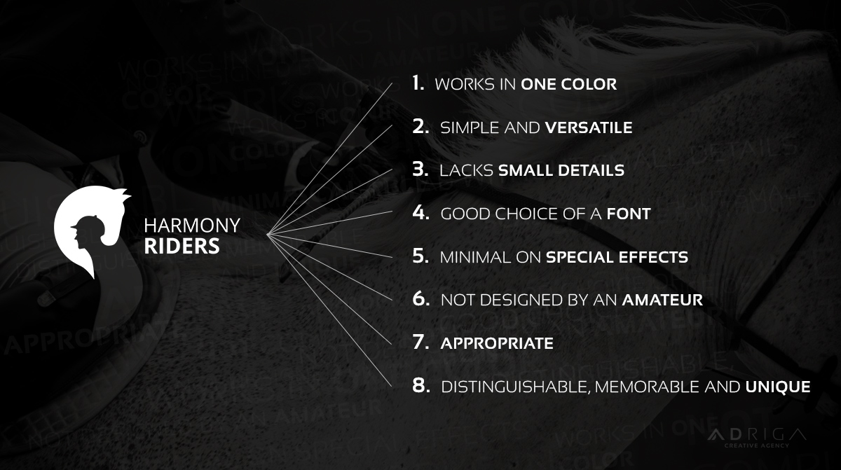
1. Works in one color
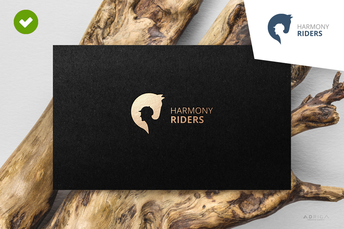
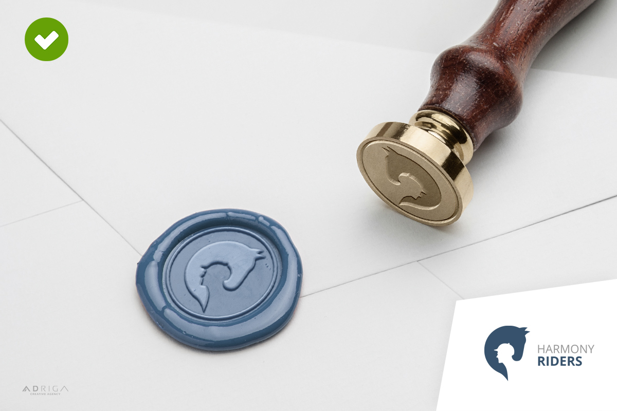
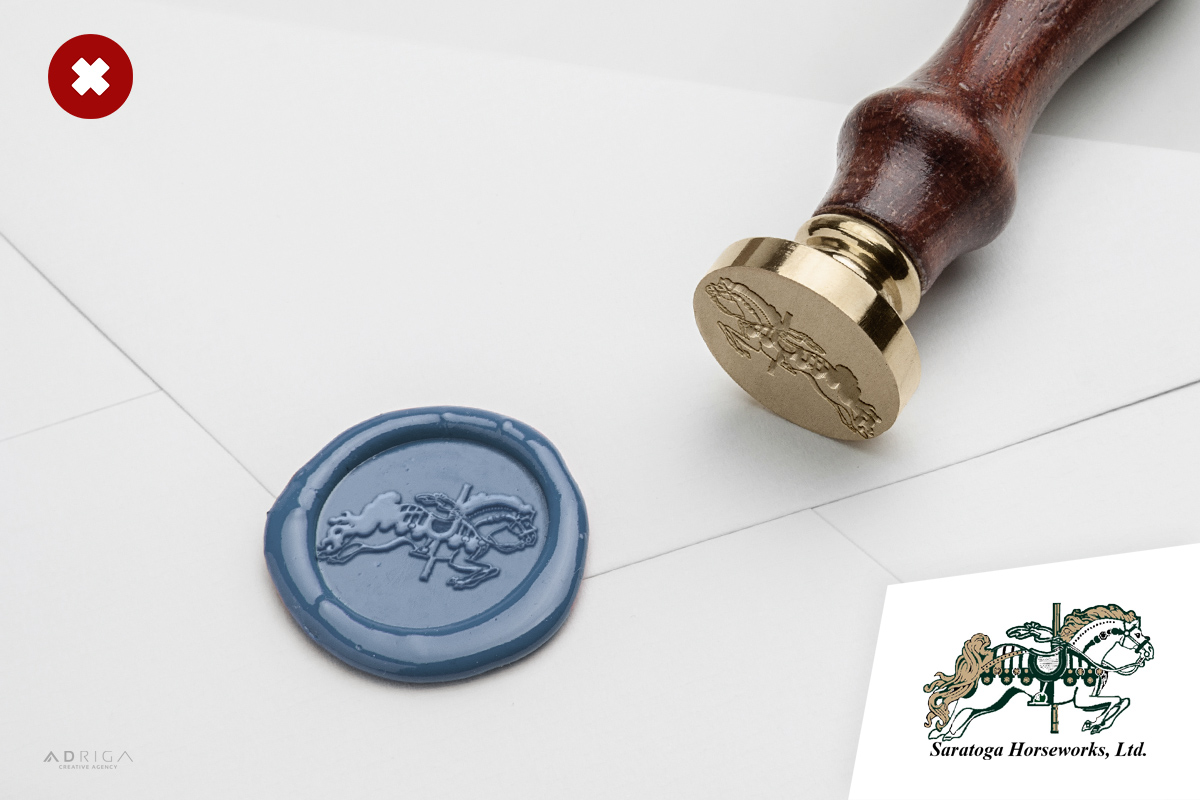
Your logo HAS to work in one color. If it doesn’t, it’s pretty pointless. There are thousands of situations where companies that don’t follow this rule get a massive headache. Just think about this: logo engraving on a metal plate at your office doors, on promotional products, on leather covers for notebooks; letterpress; gold foil on business cards; cutout logo on various boxes and packaging; stencils; wood carvings; wax seal and rubber stamps; embossed logos; environmental rules (city laws, one color logo requests for various ad situations) and thousands of other real-life examples.
2. Simple = Versatile
Simplicity is the purest form of genius, as Albert Einstein once remarked. However, simple doesn’t mean basic or generic. All iconic logos are simple: Apple, McDonald’s, Amazon, Nike, Google, Twitter, .etc. A simple logo design generates easy recognition and allows the logo to be versatile and usable in any situation.
3. Lacks small details
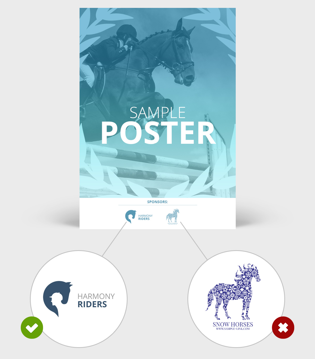
Highly detailed and overly complex logo designs don’t scale well when printed or viewed in smaller sizes.
4. Good choice of a font
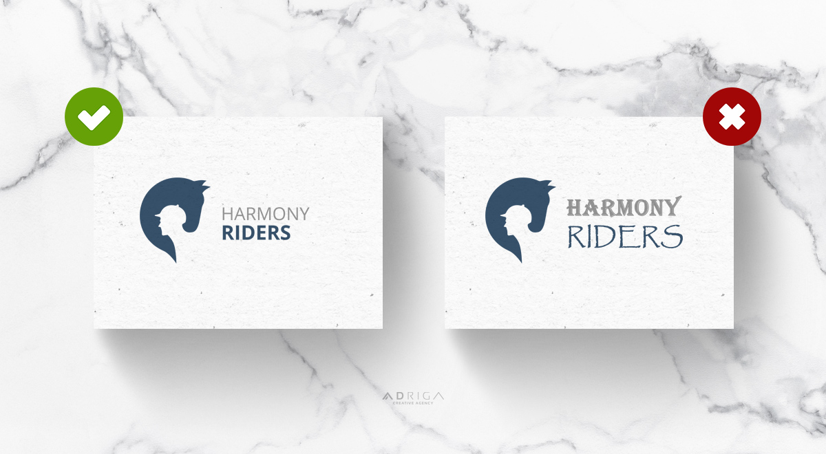
Logo often fails because of poor choice of a font. Every font has its own characteristics, it has to be in balance with the symbol and in most cases – it cannot compete for attention. Comic Sans, Papyrus, Algerian and a list of at least 50 other popular, overly used fonts by amateurs is always a poor choice of a font.
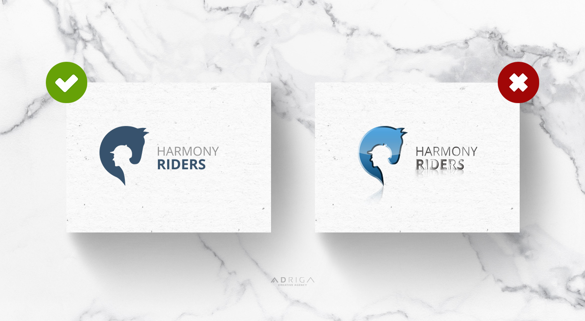
5. Minimal on special effects
Less is more, so let’s just stick to that. Filters and special FX really sounds pretty cool, but are usually applied by inexperienced designers to compensate for “something that’s missing”. While it certainly shows how cool the skills and latest design software is, it doesn’t help for the professional look of a client’s logo.
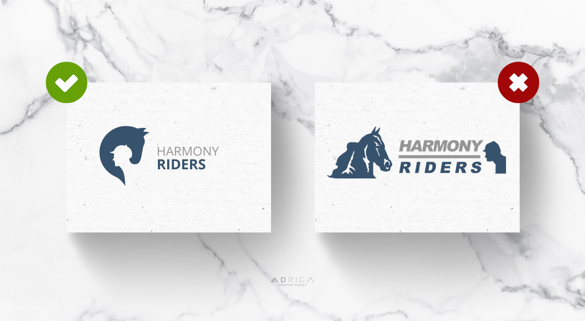
6. Not designed by an amateur
Especially if logo involves illustrations. A professional graphic designer is also a professional artist, who truly and naturally understands proportions, composition and is able to create an original artwork.
7. Appropriate
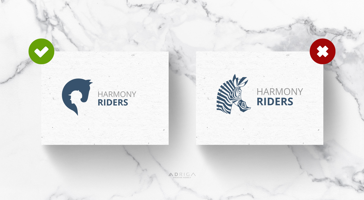
Our given example might generate a smile or two, but this is actually an important rule. Logo must represent the brand. If that’s a toy shop or even a high quality hosting company that’s going to be super friendly, funny and open minded with their clients, a laughing zebra face might even be a good choice! The characteristics of the logo must always represent the tone and values of the company.
8. Distinguishable, memorable and unique
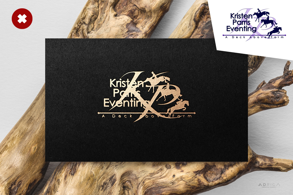
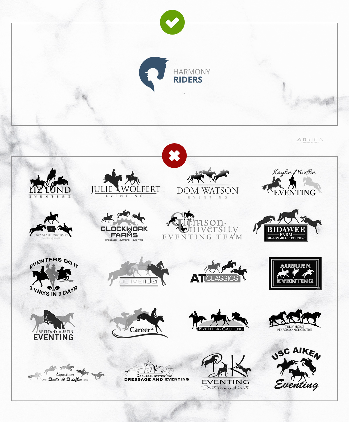
Surely there might be tons of other logos representing the same field as your company and some features of your own will be similar to some of them, but creating a logo that’s surprisingly similar to others is a 100% bad idea. Apart from the copyright issues, the viewers might confuse your company with a different one or simply have a very hard time remembering it. Just look at the example above – these are logos of real life businesses and you can clearly see an overused cliché, seems like everyone thought the same thing: “we will look professional if we use three or more horse silhouettes running and jumping over the letters”. Your logo should be able to stand out and if it additionally does have a story behind it – that’s the last, but nonetheless an important rule of professional logo design! Dare to be different!
In the creation of this post, we edited our designed logo for “Lucky Horseshoe” equestrian sport club. Feel free to explore more on our portfolio.
>> We are working with clients all over the world. Press here to learn more <<

logo is company’s identity . It needs to lead the viewer towards thoughts of your products immediately. Your company’s identity is an imperative element which communicates visually through the logo you choose.
Thanks for the info!
I thought it was interesting how you talked about simplicity and how that will translate in a lot of different mediums. My friend is thinking about getting a logo made for her small business, but doesn’t really know where to start. I’ll be sure to bring up a lot of these points with her so that she can get some ideas and take them to a professional designer. I think that it will really make a difference for her.