
Why should creating a logo design cost more than $5,000 and take over a month when alternative offers for $50 promise to accomplish the task within a few days? The following brief, clear, and illustrative breakdown offers insight into our process of creating a high-quality, professional logo and visual identity. This article is based on our case study for the residential village “Laimes Krasti” (Shores of Happiness — now renamed KAIGAN VILLAS, retaining the complete visual identity designed by our team), currently under construction on a lakeshore surrounded by a pristine forest.
Step 1: Determining Client Requirements

The process begins with open communication with the client to discuss all project aspects and requirements in detail. Having collaborated with clients worldwide and successfully created over 1,200 brand identities, we have optimized our workflow to respect our clients’ time while delivering an efficient, client-friendly experience. All details are discussed via email, chat, video calls, or in person, depending on the client’s preference. Our project managers are always ready to adapt and visit the client’s place of business whenever necessary. Once the project scope is set, we provide a proposal with estimated costs and deadlines. A 50% advance payment is required to begin the creative process.
Step 2: Analysis
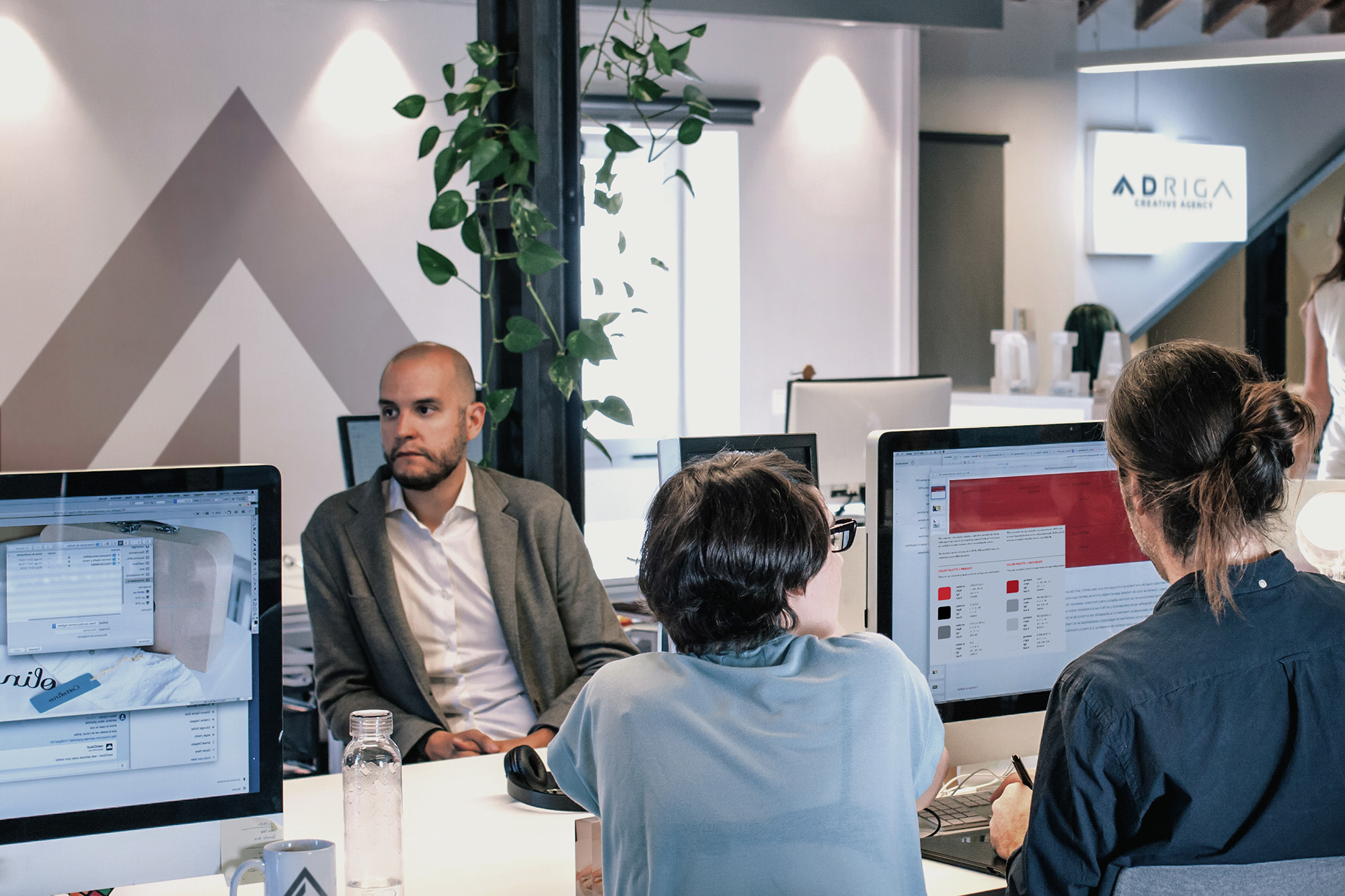
Based on the information gathered in Step 1, we conduct a thorough analysis of the client’s industry, competitors, and stylistic direction. This gives us a clear understanding of the core values the logo should embody while ensuring it remains visually distinct from competitors. Throughout this process, we adhere to our 8 golden rules of logo creation.
Step 3: Brainstorming & Inspiration
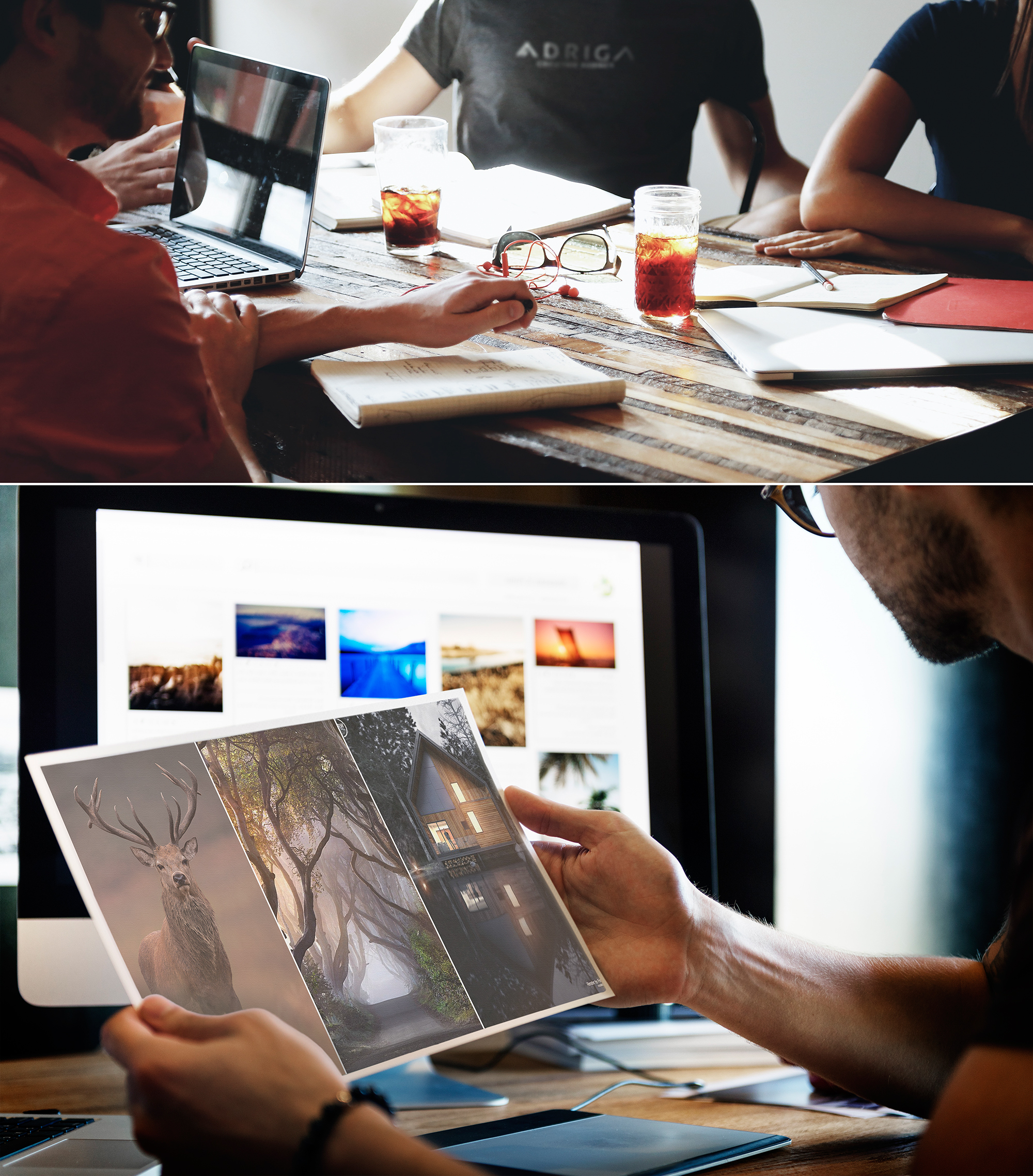
Our team of 20 specialists includes 5 professional logo designers. While we share core values and follow standard AD RIGA design guidelines, each team member brings a unique perspective and creative ideas. This phase involves extensive brainstorming—both in person and remotely, as our team includes designers based in Spain and the USA. We build mind maps, curate mood boards, explore creative visions, and select inspirational materials to lay the groundwork for the next stage.
Step 4: Drawing Black-and-White Sketches
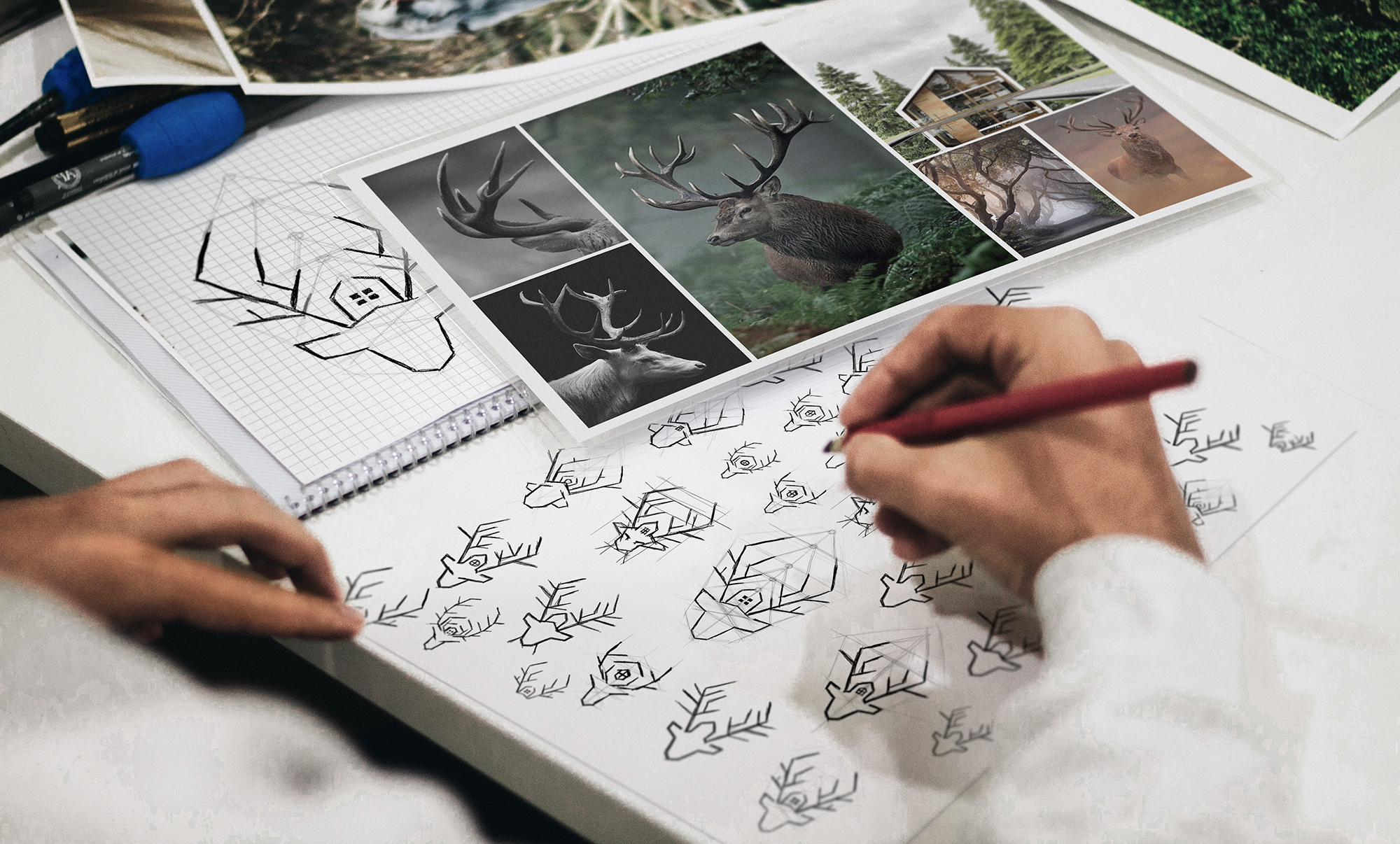
One of the most labor-intensive and creative stages is sketching, where our artists are given full freedom to explore ideas. Sketches are drawn on paper, notebooks, tablets, and sometimes even napkins when an idea strikes unexpectedly. Our artists constantly refine these concepts throughout the process, exploring as many variations as possible. We do not present work to the client at this stage so that designers can feel completely uninhibited in their creative exploration. Crucially, sketches are created in black and white because a logo MUST work perfectly in a single color. Otherwise, it will not be suitable for engraving, foil stamping, seals, or other future brand applications. Color selection takes place in the following step.
Step 5: Defining Brand Colors and Fonts
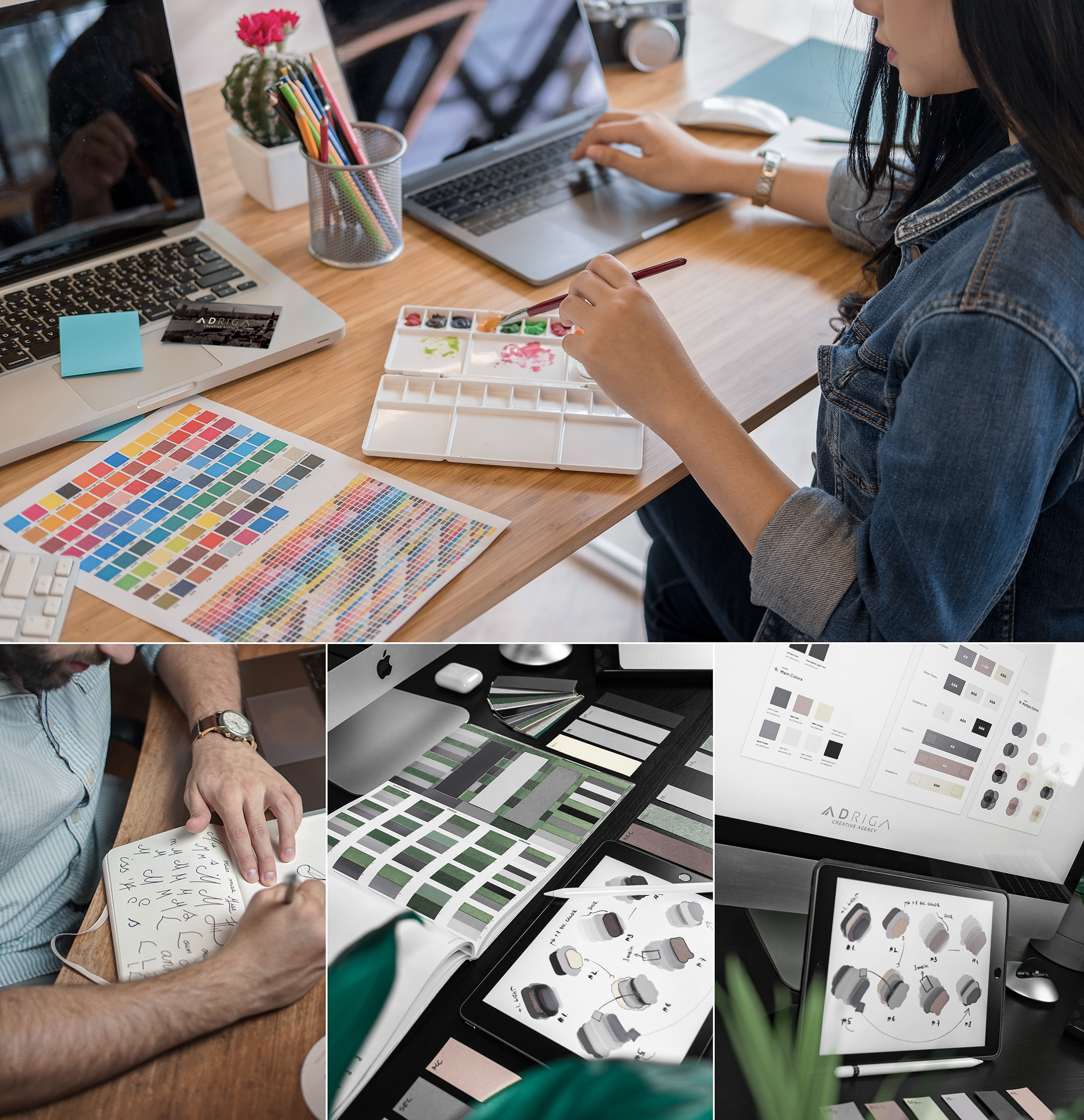
While selecting the best sketches, we begin defining brand colors and typography. The color palette must represent the company’s personality and perform flawlessly across both print and digital media. The same principle applies to fonts, which must harmonize with the icon. Additionally, we identify secondary typography that complements the brand identity across future marketing collateral. For select concepts, custom typefaces are created from scratch to ensure the connection between the lettering and the brand mark is entirely unique and harmonious.
Step 6: Developing Concepts
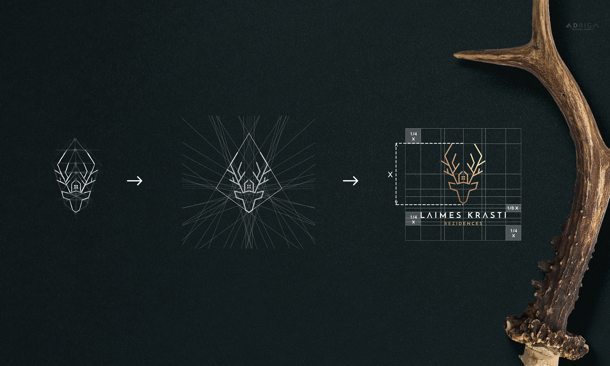
To move forward, the creative director selects the 3 best sketches for digital vector creation. Each concept is precisely constructed on technical grids, paying meticulous attention to angles, composition, line weights, and overall proportions. While this precision might seem excessive to an outsider, this attention to detail is what makes the final logo truly professional and visually compelling.
Step 7: Preparing Photorealistic Visualizations
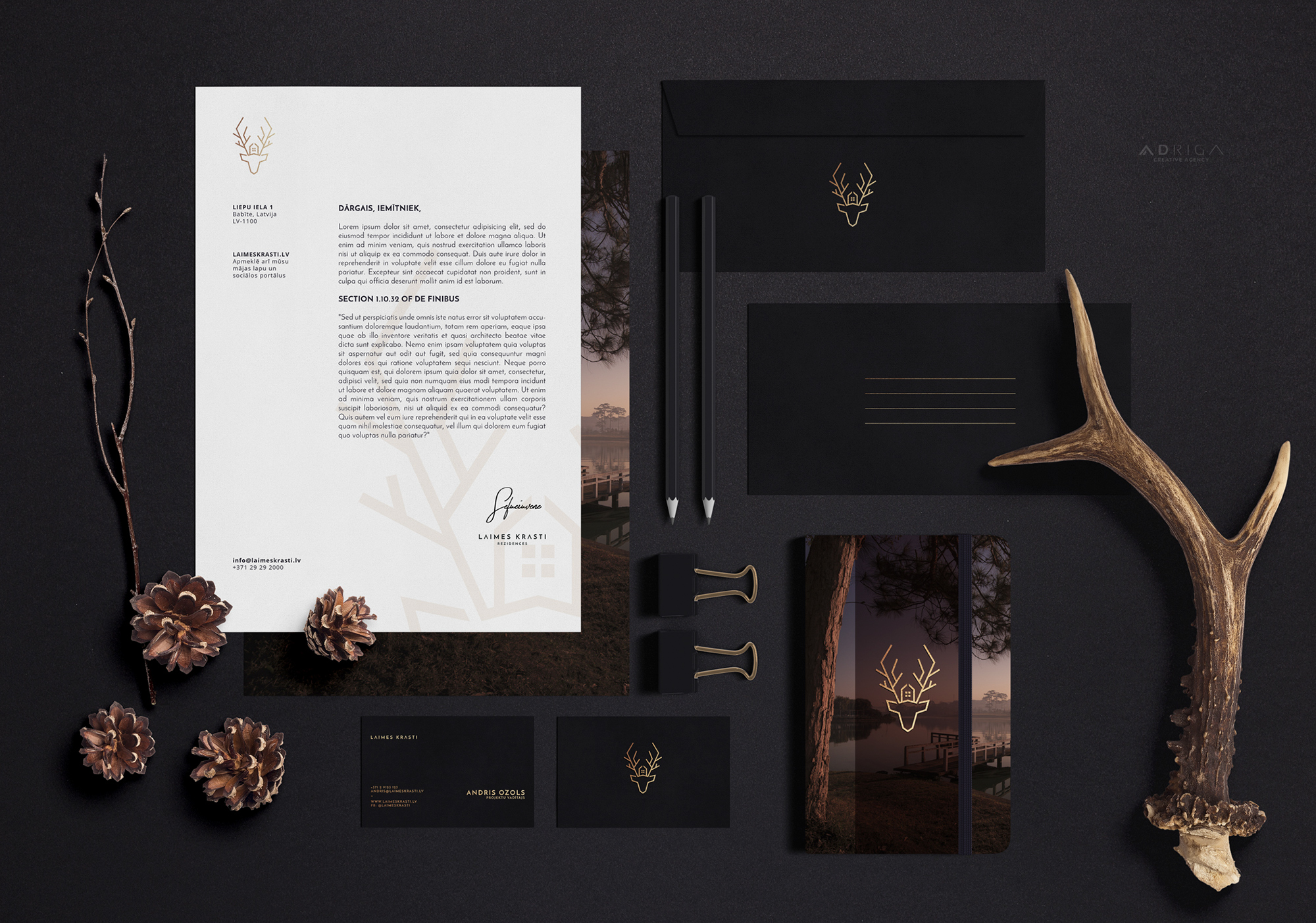
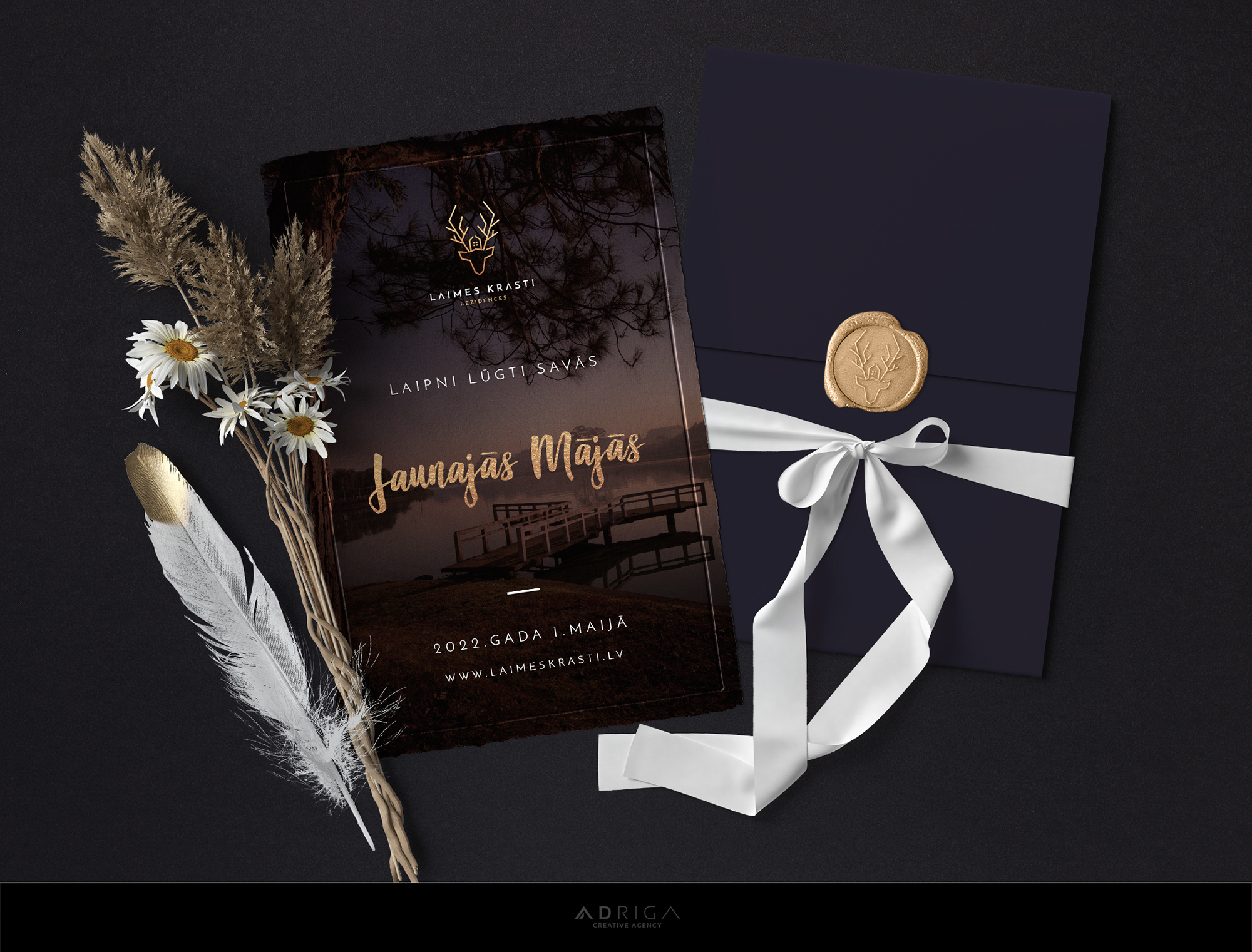
Finally, we develop a complete corporate identity presentation (editor’s note: full corporate styling is an optional add-on service) featuring photorealistic mockups for each concept. These visualizations help the client understand the story behind each direction and see how the logo performs in real-life applications. Below are the sample visualizations created for the “Laimes Krasti” (KAIGAN VILLAS) case study.
Concept #1: Our goal was to create a distinctive symbol for “Laimes Krasti” that sets the village apart from competing residential developments while conveying its unique story. The deer symbol has deep mythological roots, historically representing a pristine environment, independence, vitality, happiness, and prosperity.
Click to view full-size images:

Concept #2:

Concept #3:

Step 8: Revisions (Optional)
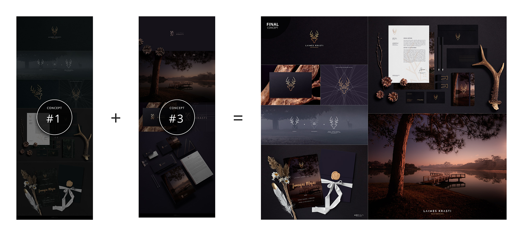
Our workflow is rigorously detail-oriented: every concept is thoroughly vetted internally before presentation, meaning major revisions are rarely necessary. However, we are dedicated to 100% client satisfaction and fully support requested refinements. In this case, the client chose Concept #1 and asked to combine it with the color scheme from Concept #3. The result is just as striking in this palette!
Step 9: Delivering Final Files and Brand Guidelines
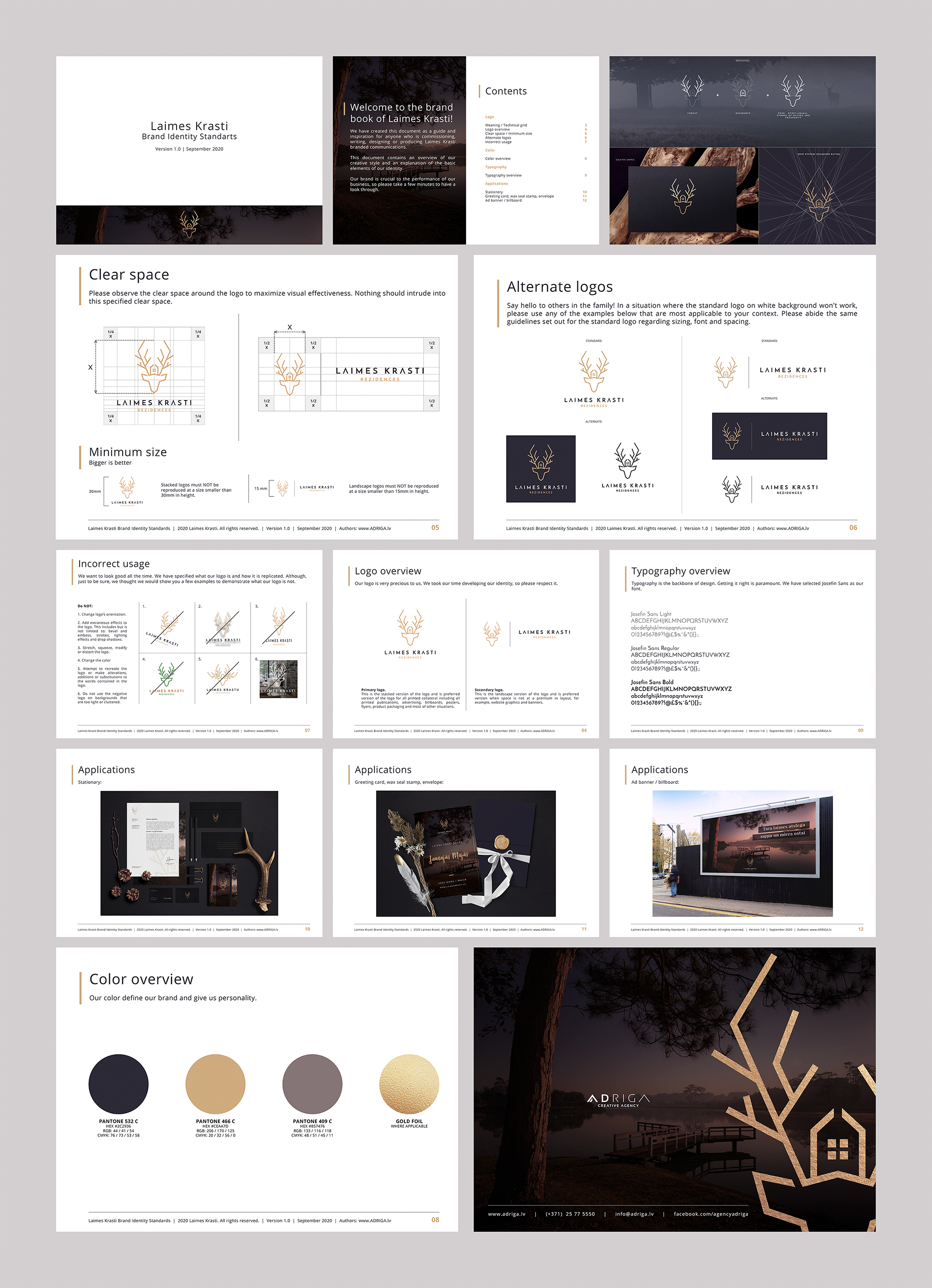
Once the client approves the final direction and settles the remaining payment, we deliver all master vector files within 5–8 business days alongside a professional visual identity brand book. This guide covers exact color specifications (RGB, CMYK, Pantone, HEX), primary and secondary logo layouts, clear space requirements, minimum sizing, font characteristics, proportions, and integration rules. These master files and guidelines ensure the brand remains consistent and impactful across all future touchpoints.
Step 10: Developing Additional Brand Assets
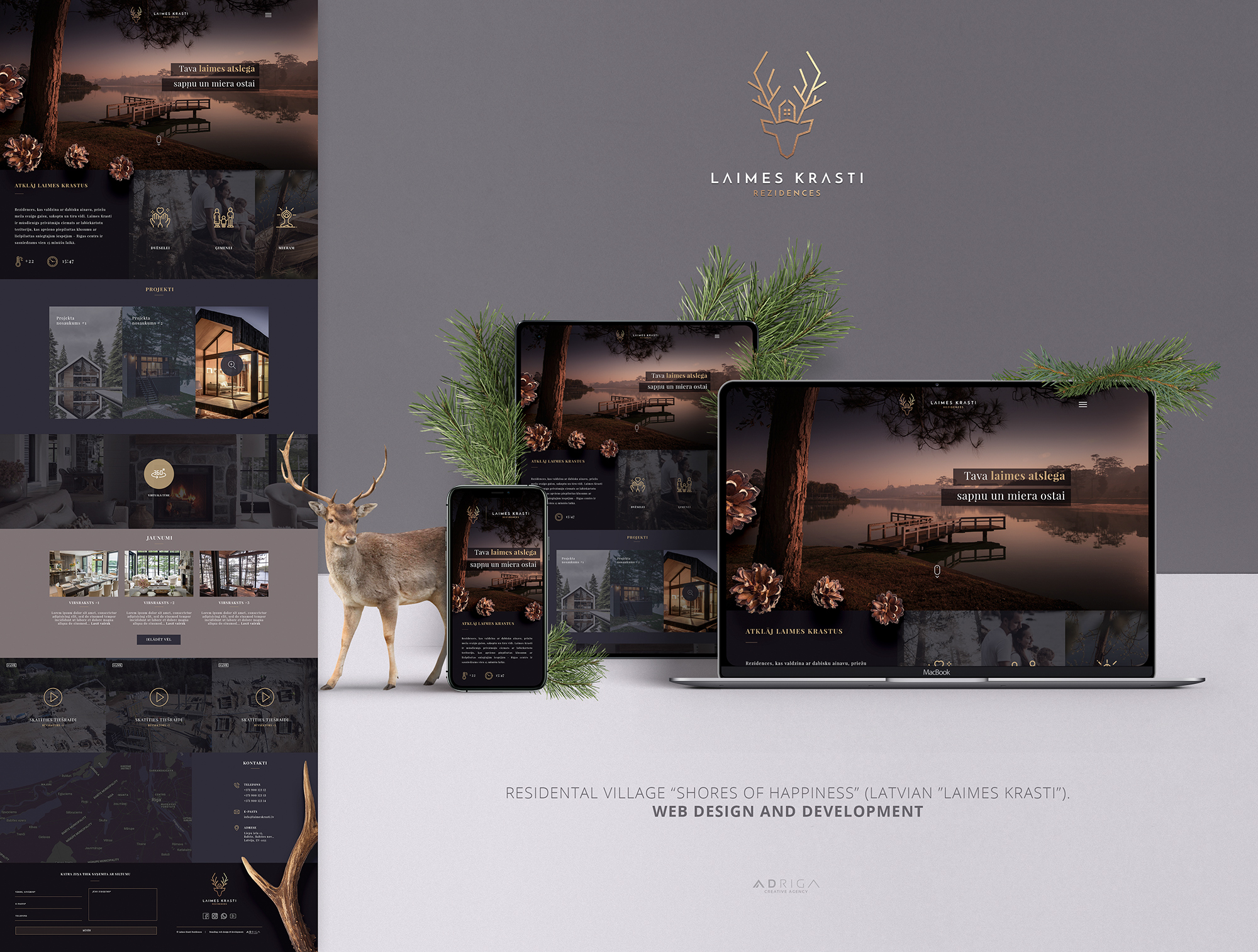
Web design and development
(At the time of publishing, the website was under construction):
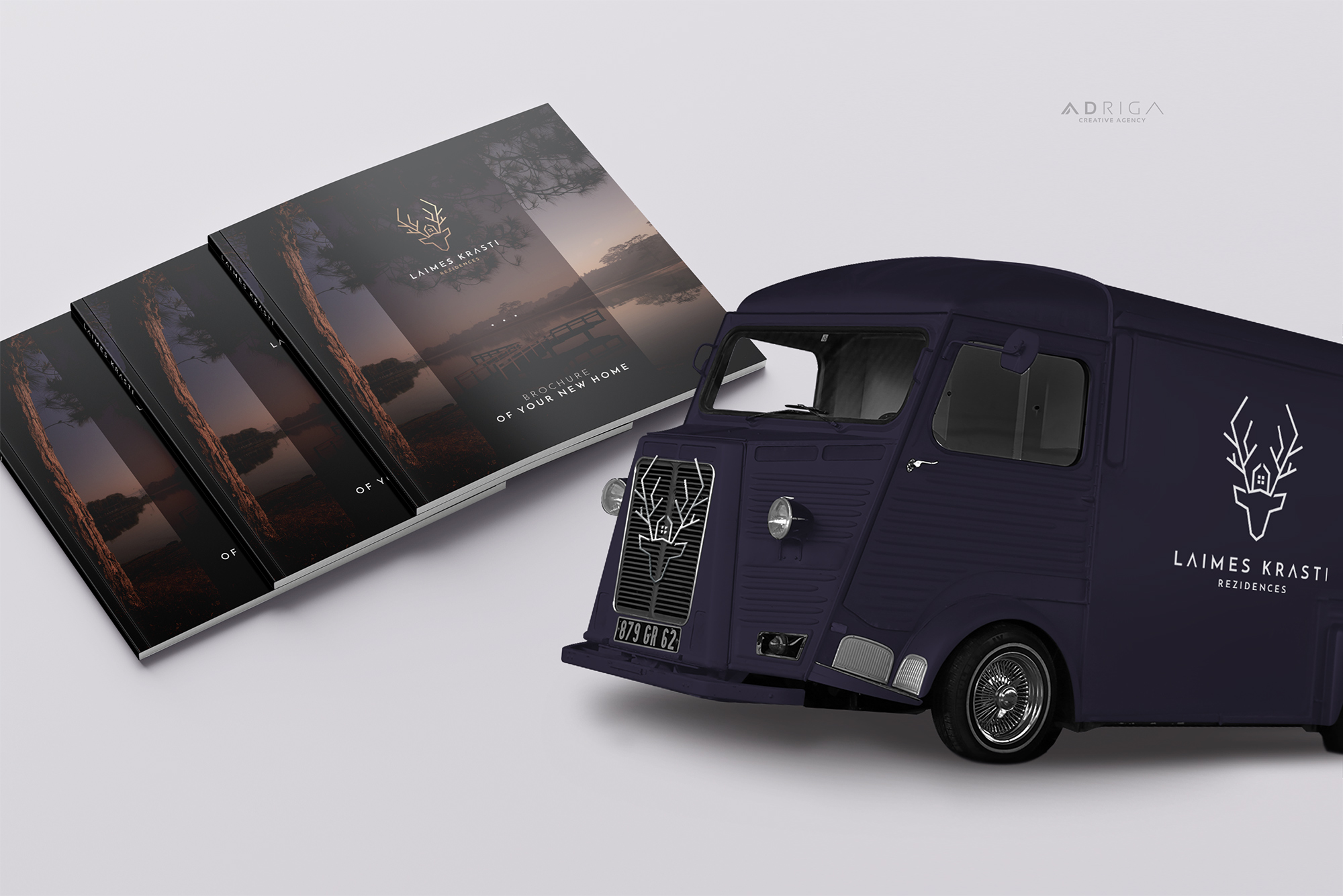
Brochures, vehicle decals, and promotional collateral:
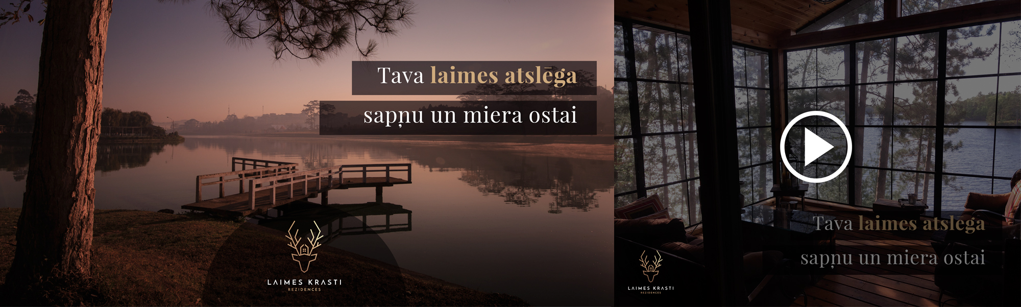
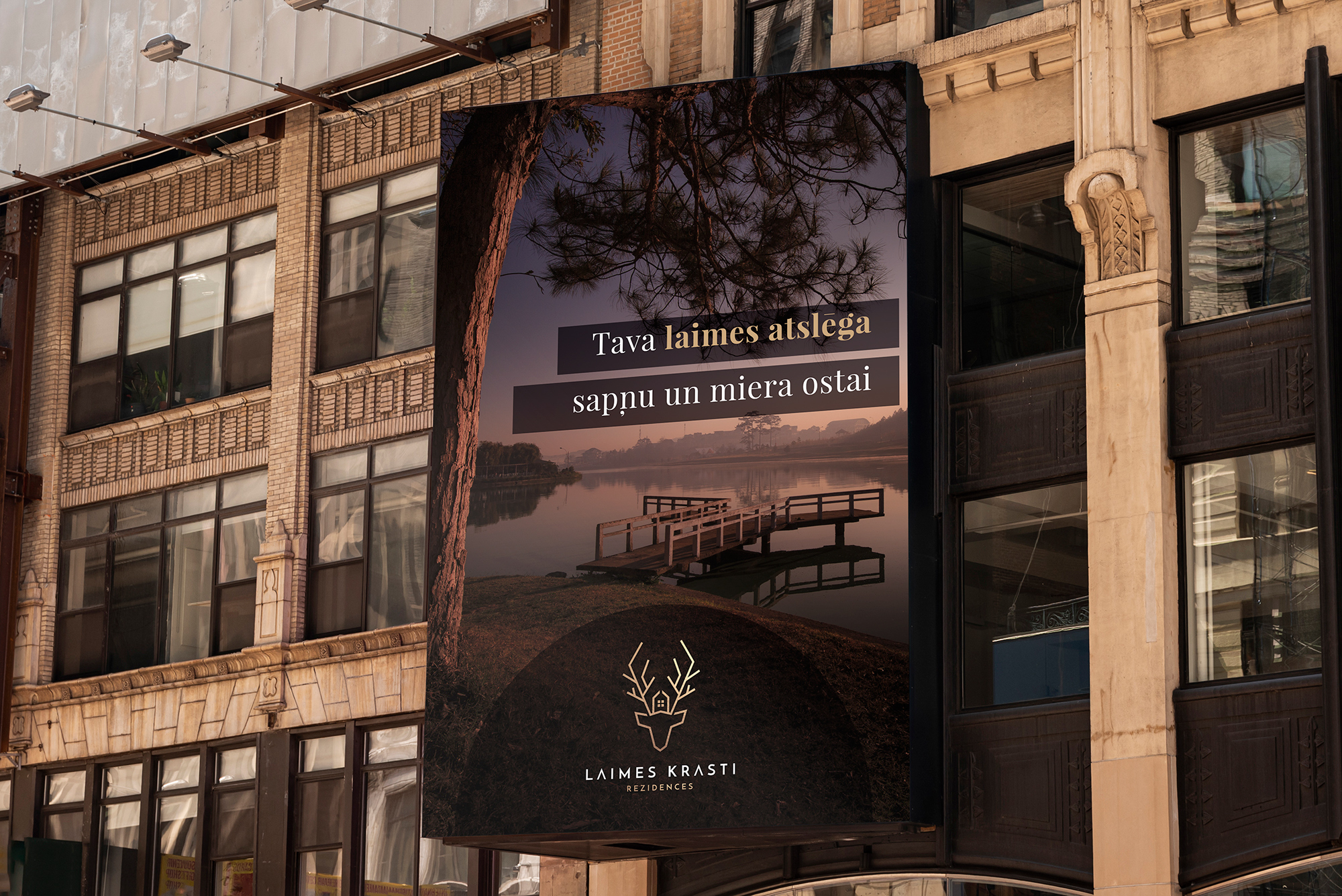
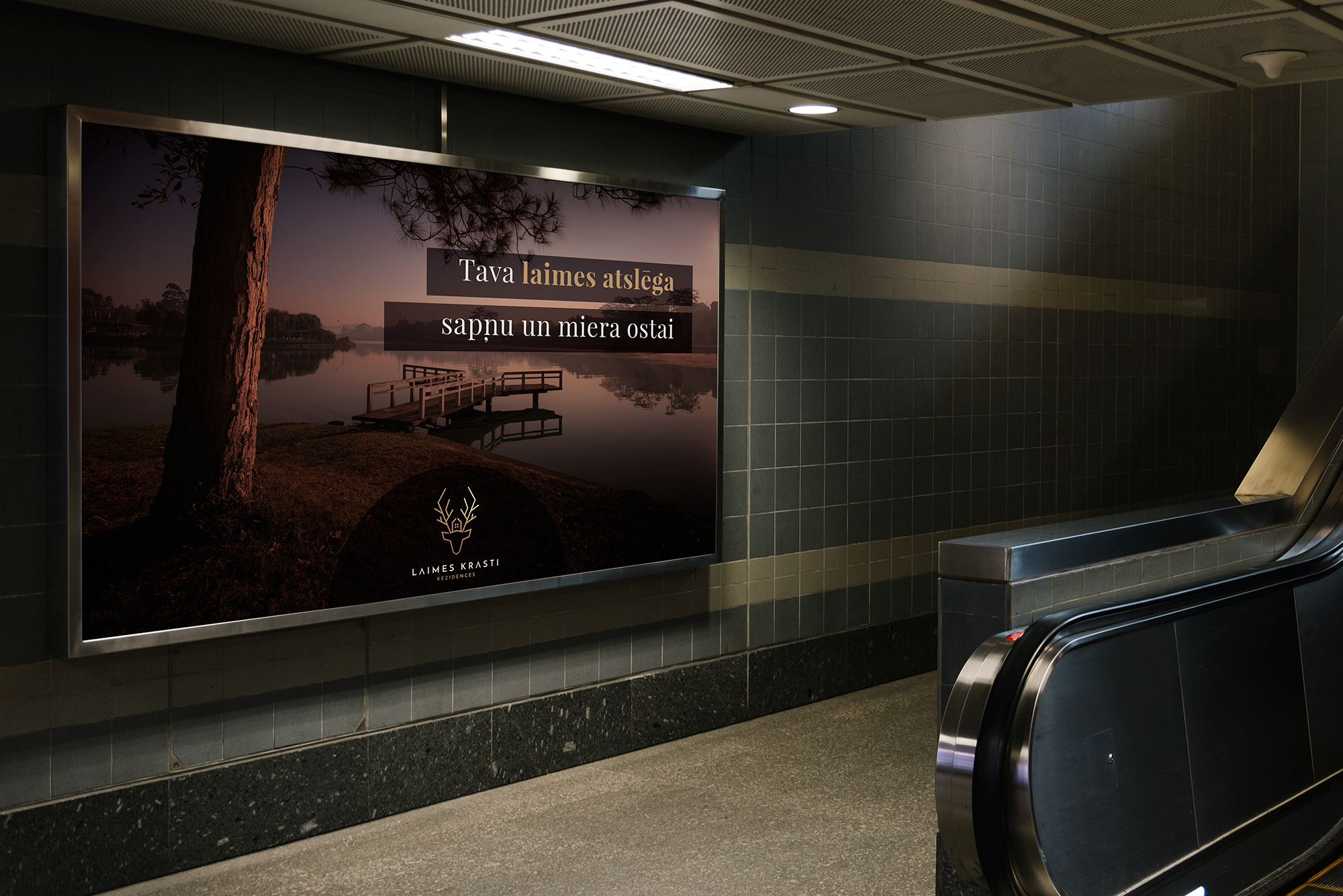
Banners, posters, billboards, and promotional video production
(Featuring professional voiceover and custom sound design):
Corporate stationery:
(Business cards, letterheads, envelopes, and presentation folders)
Conclusion
Creating a visual identity is a comprehensive effort that serves as an important investment in any business, assuring customers of your quality, reliability, and professionalism.
Developing a professional logo and visual identity is not a cheap endeavor; therefore, we caution everyone to be mindful when evaluating low-priced offers promising quick turnarounds. Even if you are initially pleased with the result and use the design for a year or more on marketing materials, you may later discover that the logo was plagiarized. In far too many cases, businesses also realize too late that their logo contains excessive detail or lacks single-color versatility, rendering it unusable for print, embroidery, or corporate signage.
Have any questions? We will be happy to help!
 info@adriga.com
 +371 25 77 555 0
 www.adriga.com
 1001 6th Ave, New York, NY 10018
 Week days (10AM - 6PM) UTC +02:00
 Follow us on Facebook
 Contact us on Telegram
 Find us on LinkedIn
 Review us on Trustpilot

Such an incredible guide on visual identity. The logo for these residences look astonishing! Thanks goes to the designers of your team for en-lighting us with your knowledge, it is helpful for many of us!
We are very glad you found it useful! 🙂
I appreciate your insightful article and thank you for sharing your process! I really enjoyed it.
There are definitely elements that I need to apply in my process as well!
What I love most about this article is that it highlights the multitude of steps that go into creating a great logo – this justifies the often misunderstood cost of branding and how creating a logo is part of a much larger process.
I already asked before the translation of this article was ready – may I use this material for my blog?
Thank you AD RIGA!
We would like that very much, thank you Jacob!
Absolutely wonderful article!!! One of the most complete and yet easy-to-understand visual identity development write-ups I’ve read to date. I love the vibe this beautifully designed deer/house/forest symbol radiates! Thank you AD RIGA for sharing with us!
Thank you so much, Audrey!
Amazing logo, amazing branding!
p.s. what font did you use?
Spot On! Very strong and educational article.
Very glad you enjoyed, thanks a lot! 🙂
I loved the line at the end “Creation of visual identity is an extensive work, which serves as an important investment…”. Can’t agree more! Logo is not a tiny, quickly created, insignificant image. It is the base of identity and symbol of the brand. Superb post…
Glad you enjoyed! 🙂
Really glad I found this, I’m planning on shifting my focus into branding and this’ll be a great help. The identity you created for Laimes Krasti is marvelous!
You’re most welcome! Thank you for the kind words 🙂
I learn from a lot of your posts… Love these step by step visuals. how do you communicate to your clients that they are all needed?…. would love to have a call with you to absorb your knowledge if you’re game!?
Hi there, Adam! Let’s have a chat! 🙂
I want to interview you regarding branding and logo design. Sent you an e-mail ?? Please check it out
Just had thoughts about it early this morning… And here I am with the opportunity!! Thanks Thanks thanks 🙂 Such a powerful identity you created there
There you go! Good luck!
I have no words to express how much I love branding. And this post is extremely helpful and inspirational. I love what you did with Laimes Krasti!
Thanks a lot! Enjoy!!
Brilliant and valuable article, thank you! The colors are very well considered.
I like the concept, some useful things to keep in mind! Keep in mind for logo designing that tools matter
This is awesome! Thank you AdRiga!
It’s very interesting to see how people work about and get their projects finalized. And the entire process that you have shown up from scratch is really interesting to go through.
Thank you, we try to make it as resourceful as possible as well as explain our process which is also very interesting for other designers.
Hey AD RIGA,
Hats off, wonderful logo. Personally, I see beauty in simplicity, and Laimes Krasti logo has that simplicity and also that “wow this is amazing” factor. I mean, its wonderful what this logo represents. Looks like it was a pretty long road to get to the final design, but the end result is AMAZING. I’ve been hooked on this in my mind for a couple of days. Love your work guys!
Seems like your system works great for you, each and every of these concepts look remarkable! I would love to have a new logo for my quilting web site. How may we proceed?
Thank you,
Connie
Thank you, Connie! It’s a well oiled machine ? Feel free to get in touch with us +371 25 77 555 0 or info@adriga.lv and we will most happy to help!
These are quite interesting tips about logo design. It is very true that outstanding creative designs attracts attention and creates a positive impression about a brand so its better it is done by experts in the field.
Thank you very much!
That is very attention-grabbing, You are an overly skilled designers.
I’ve joined your rss feed and look ahead to seeking extra
of your fantastic posts. Also, I’ve shared your site in my social networks
Great definition and description of how visual identity is created. I love it. Good work!
Real facts right here. Superb logo on “LaimesKrasti”! Thanks for sharing. Keep inspiring 😉