
Why should creation of a logo design cost more than $5,000 and take more than a month if there are alternate offers for $50 that promise to accomplish the task within a few days? The following brief, clear, and illustrative steps offer insight into our process of creating a high-quality, professional logo and visual identity. The article is based on our case study for the forthcoming Residential Village “Laimes Krasti” (Shores of Happiness) currently being built on the shores of a lake surrounded by a pristine forest.
Step 1: Determining the customer’s wishes
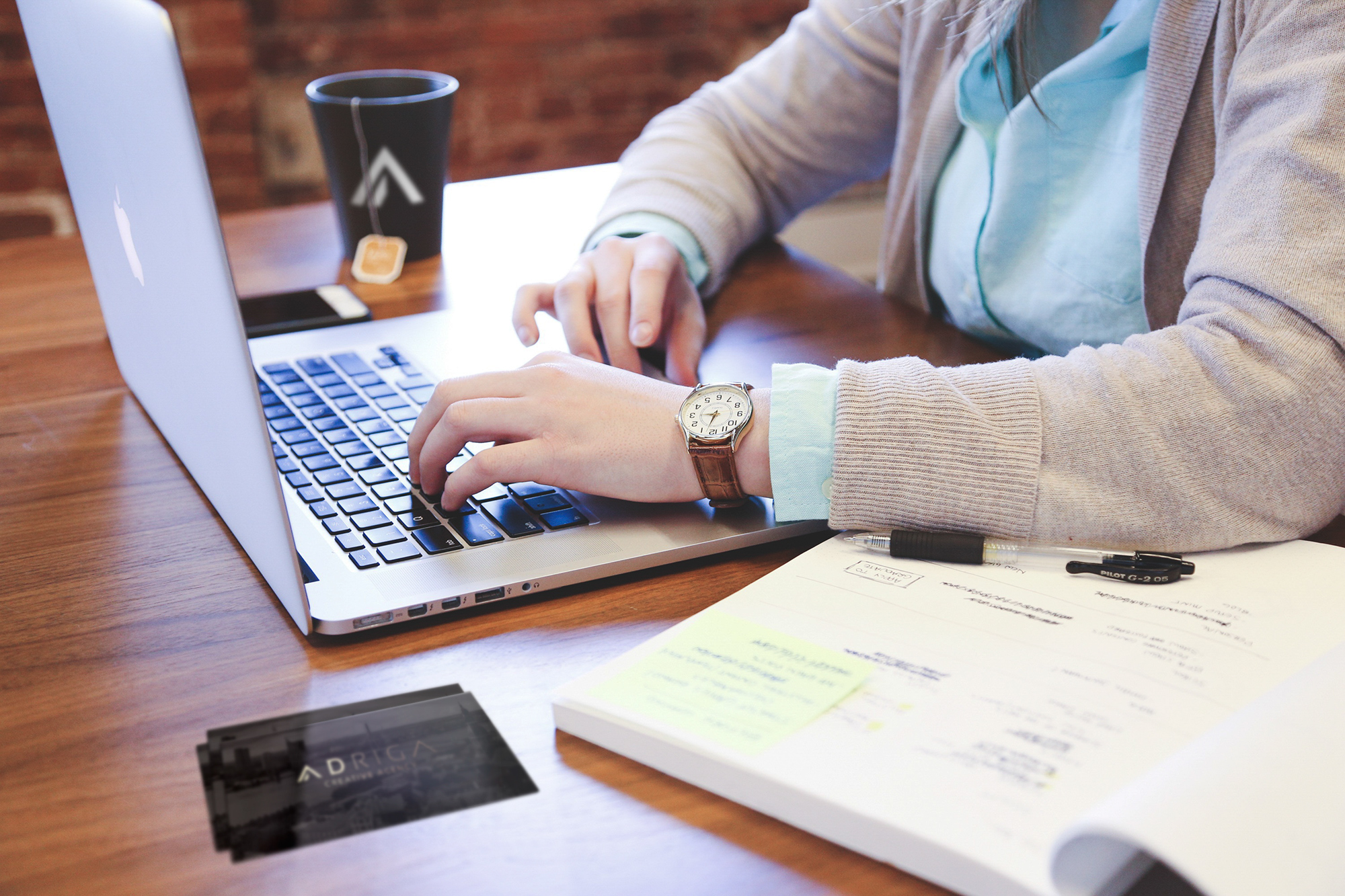
The process starts with communication with the customer. All project-related aspects and requirements are discussed in detail. We collaborate with customers throughout the world and have successfully created more than 1,200 brand identities; thus, we have optimized the process as much as possible in order not to waste the customer’s time and to be able to provide excellent and customer-friendly services. All details are discussed using e-mail, chat, video call or in person depending on the customer’s convenience. Our project managers are always ready to adapt and eager to visit the customer at the place of business whenever necessary. A proposal for the estimated cost and completion deadlines is then provided. An advance payment of 50% is expected to continue the creative process.
Step 2: Analysis
Based on the information received in Step 1, we conduct a thorough analysis of the customer’s field of activity, competitors, and style directions thereby seeking a better understanding of the nature and values to be presented by the logo, avoiding any visual similarities with competitors of the specific project. Throughout the process we follow 8 golden rules of logo creation.
Step 3: Brainstorming & inspirational materials
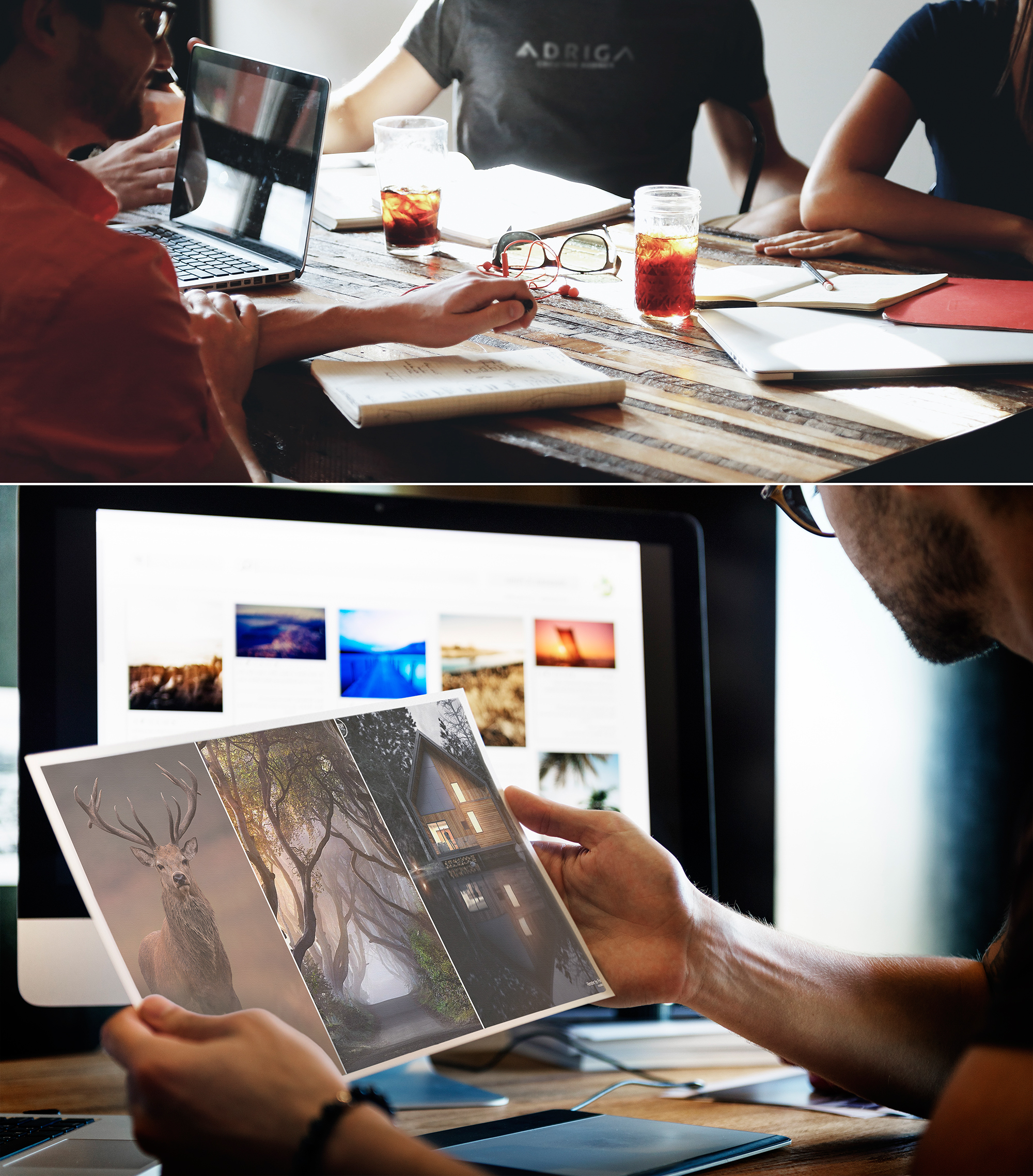
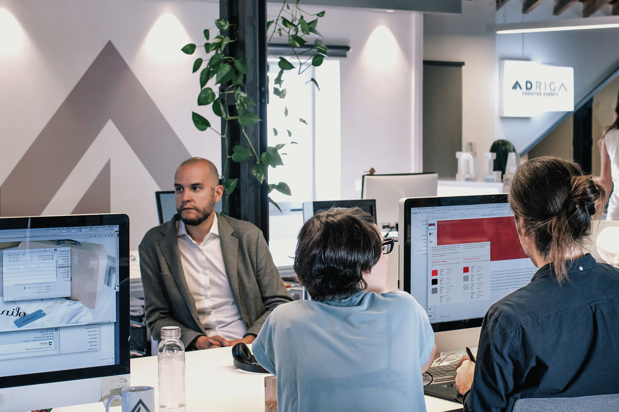
Our team of 20 specialists includes 5 professional logo designers. Although we stand for shared values and follow common AD RIGA design development guidelines, each of us has his or her own individual perspective and ideas. This step includes extensive creative brainstorming either in person or remotely (since we have designers from Spain and USA on our team), creating idea maps and mood boards, discussing visions, and selecting many inspirational materials, which take us to the next step of the idea journey (see below).
Step 4: Drawing black-and-white sketches
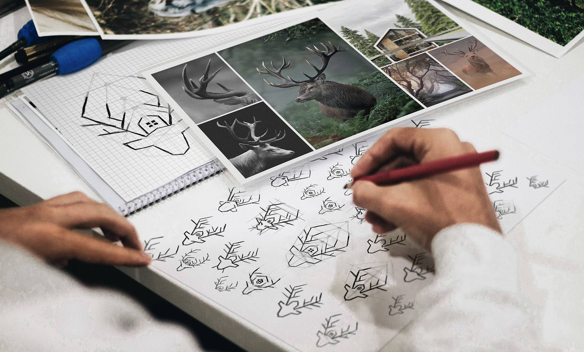
One of the most labor-intensive and unique steps is sketching where none of our artists are restricted to a set idea. The sketches are made on drawing paper, notebooks, tablets, and sometimes even on napkins, hands, and other body parts when an idea has come to mind suddenly and unexpectedly. Artists constantly contemplate on the project throughout the creation process. The best sketches are developed with a maximum number of variations. It is important to note that we do not show the results of our work to the customer at this step, for the artists to feel absolutely free to pursue the flight of their thoughts and the implementation of their ideas. The sketches are drawn in black and white because the logo MUST work in a single colour. Otherwise, the logo will not be suitable for engravings, foil stamping, seals, and countless other applications in the company’s future. The decision on the colours is made in the next step (see below).
Step 5: Defining brand colours and fonts
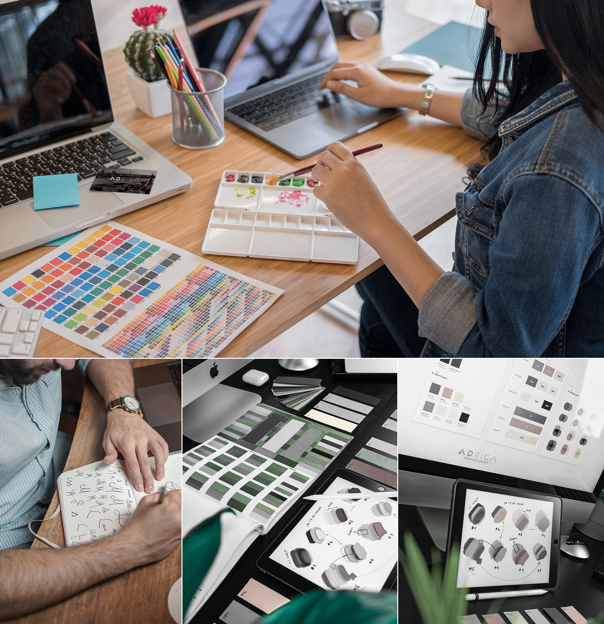
While selecting the best sketches, we start the work on defining brand colours and fonts. The colours must both characterize the company and have a great effect in real life when printed or reproduced electronically. The same applies to fonts as they must harmonize with the used symbols. In addition, in this step we have to identify which fonts will complement the company’s style and advertising elements to make sure the logo looks great everywhere. In some concepts, individual typefaces are created, which means that the artist draws each and every letter from scratch to make sure the connection with the logo symbols is even more unique and fully harmonic.
Step 6: Developing concepts
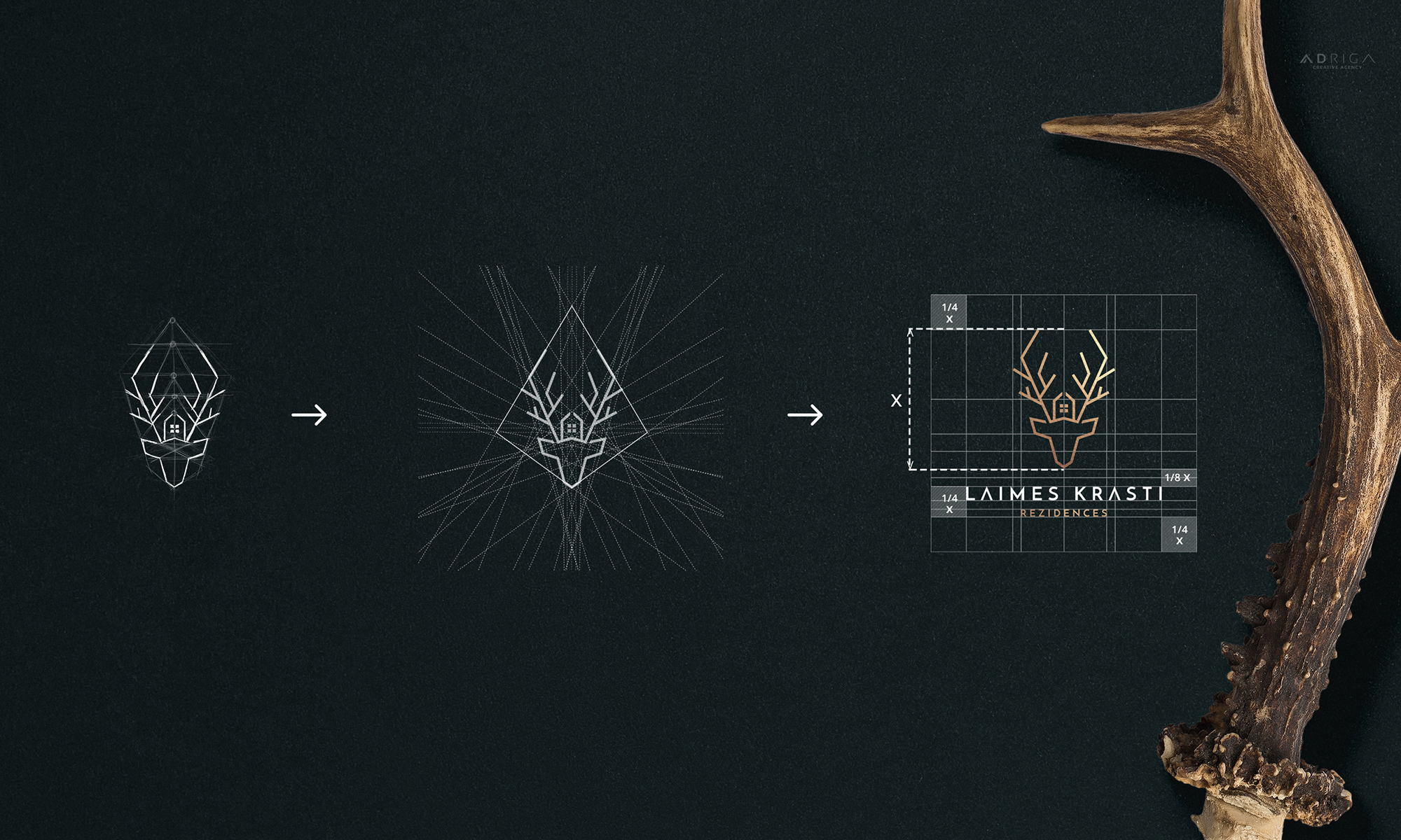
To continue the work, the creative director picks 3 best sketches and gives the green light for further development and creation of computer graphics. Each of these sketches is then “built” again on technical lines, pedantically paying attention to each and every angle, composition, line length, width, and overall proportions. This might seem unnecessary or even too excessive to an outsider, but this accuracy and respect for all nuances makes the final logo professional and visually attractive.
Step 7: Preparing sample images
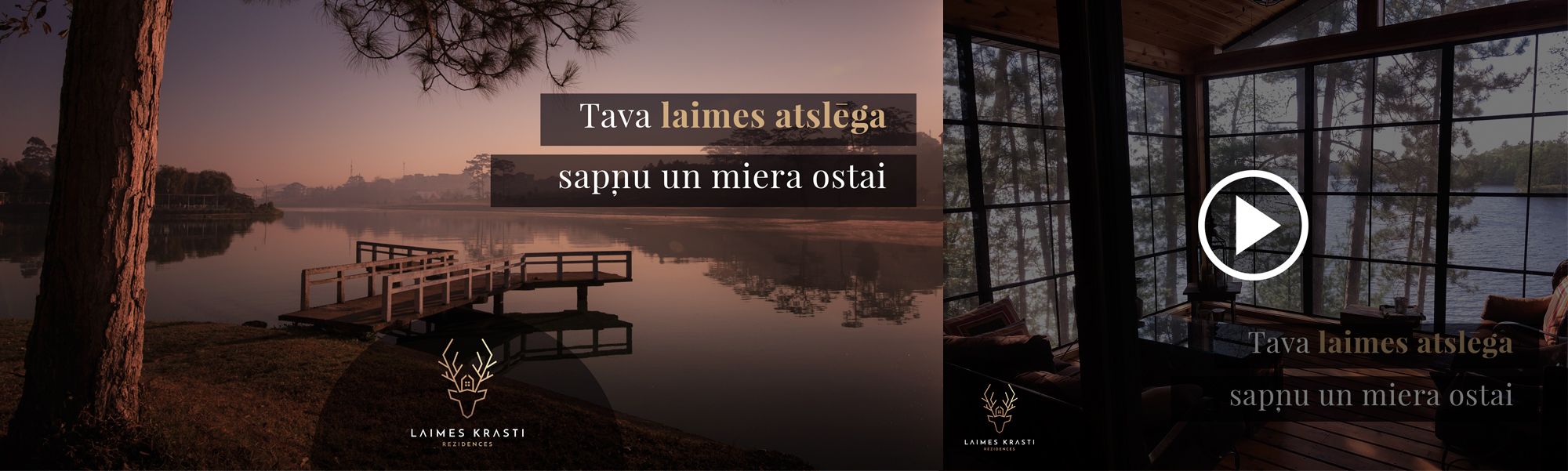
At the end, we develop a full corporate style package (editor’s note: the corporate styling is an extra service) and professional sample images with photorealistic visualizations for each of the concepts to effectively help with the final choice. Such visualizations allow the customer to better understand the concept story and see how the logo will work in real life. Below you can see our sample images for the case study “Laimes Krasti”.
Concept #1: Our intention was to create a special symbol associated with Residential Village “Laimes Krasti” that would distinguish the village from other residential properties and bring its own unique message. The symbol of a deer has roots in mythology: in the past, deer was believed to be a sacred animal symbolizing clean environment, independence, energy, happiness, and wealth.
Click to download full-size images:
![]()
Concept #2:
![]()
Concept #3:
![]()
Step 8: Revisions (optional)
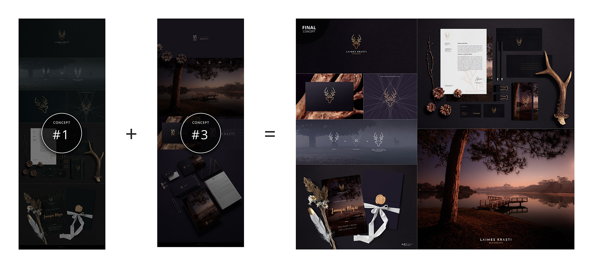
Our work is always detail-oriented: each idea and sketch is examined in every possible version before we get to the final concept; therefore, we do our job being fully confident that all the revisions are already made and will no longer be necessary. We are interested in guaranteeing a 100% satisfaction; so, we respect a customer’s requests for any changes. In the case at hand, the customer picked concept #1 asking to combine it with colours from concept #3. No problem! The concept is effective in these colours as well.
Step 9: Preparing final files and guidelines
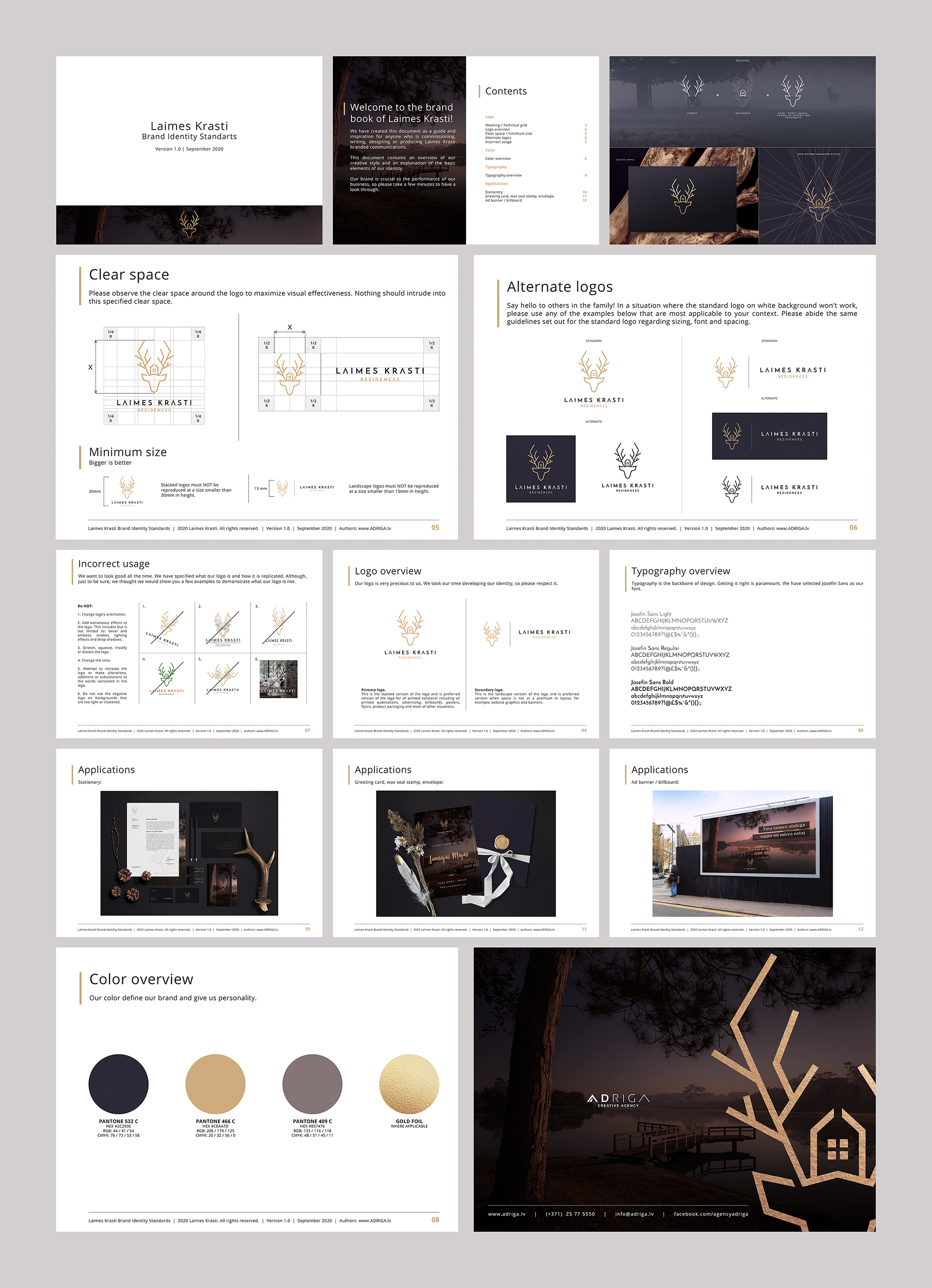
When the customer has decided on the final concept, we ask to make the second payment and, in 5-8 days, we prepare the final files of the selected concept + professional visual identity guidelines (brand colours with accurate RGB, CMYK, PANTONE, and HEX colour codes, primary and secondary versions of the logo, allowed font tones, integration instructions, mandatory free space around the logo, minimum size, use in limited spaces and other standard environments, font characteristics, proportions, and various other details) – a crucially important visual identity brand book for any company with long-term goals. These files will assure the customer that the logo will be really effective regardless of the environment in which it is used.
Step 10: Creating other elements
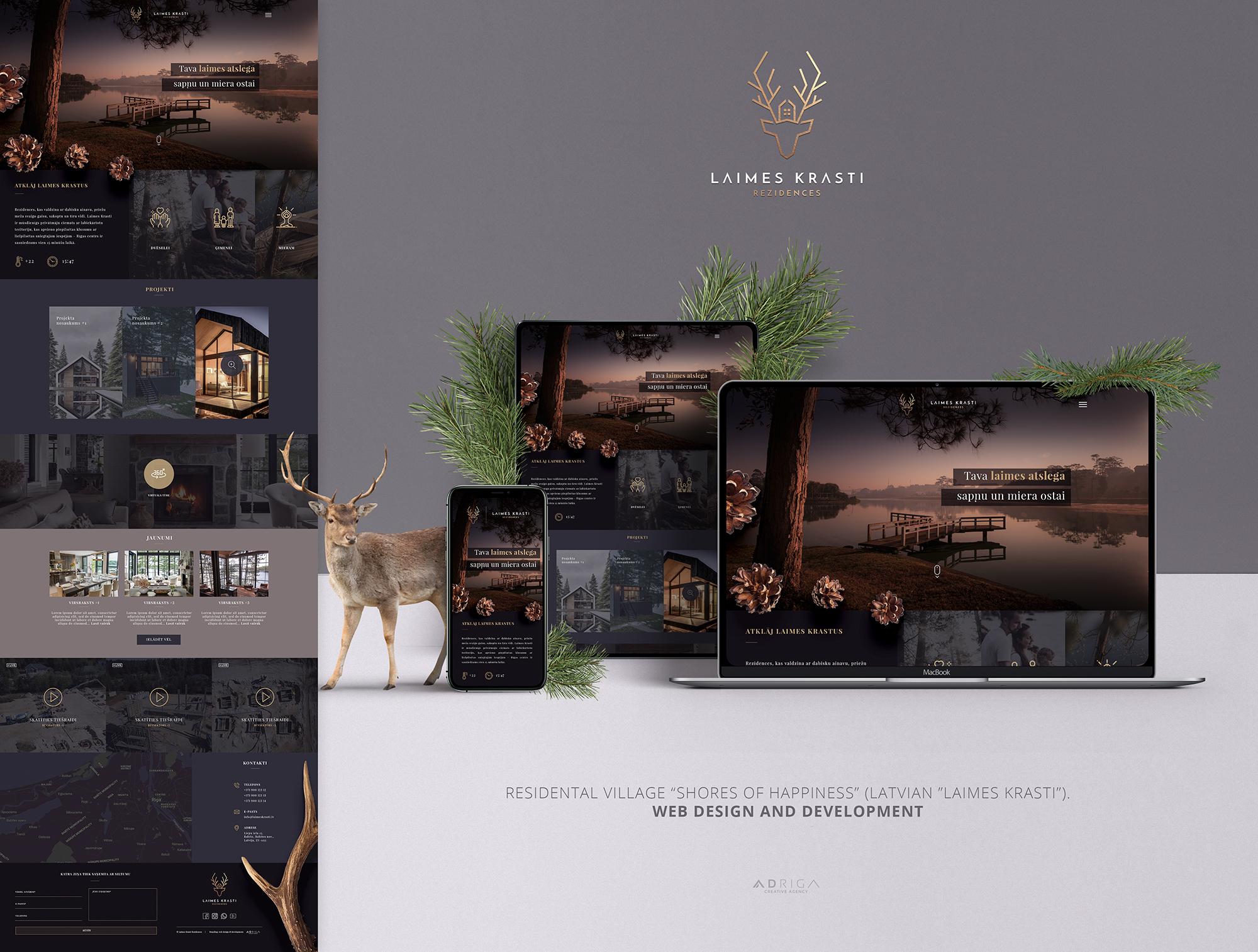
Web design and programming (as of the date of the article, the website of “Laimes Krasti” is under construction):
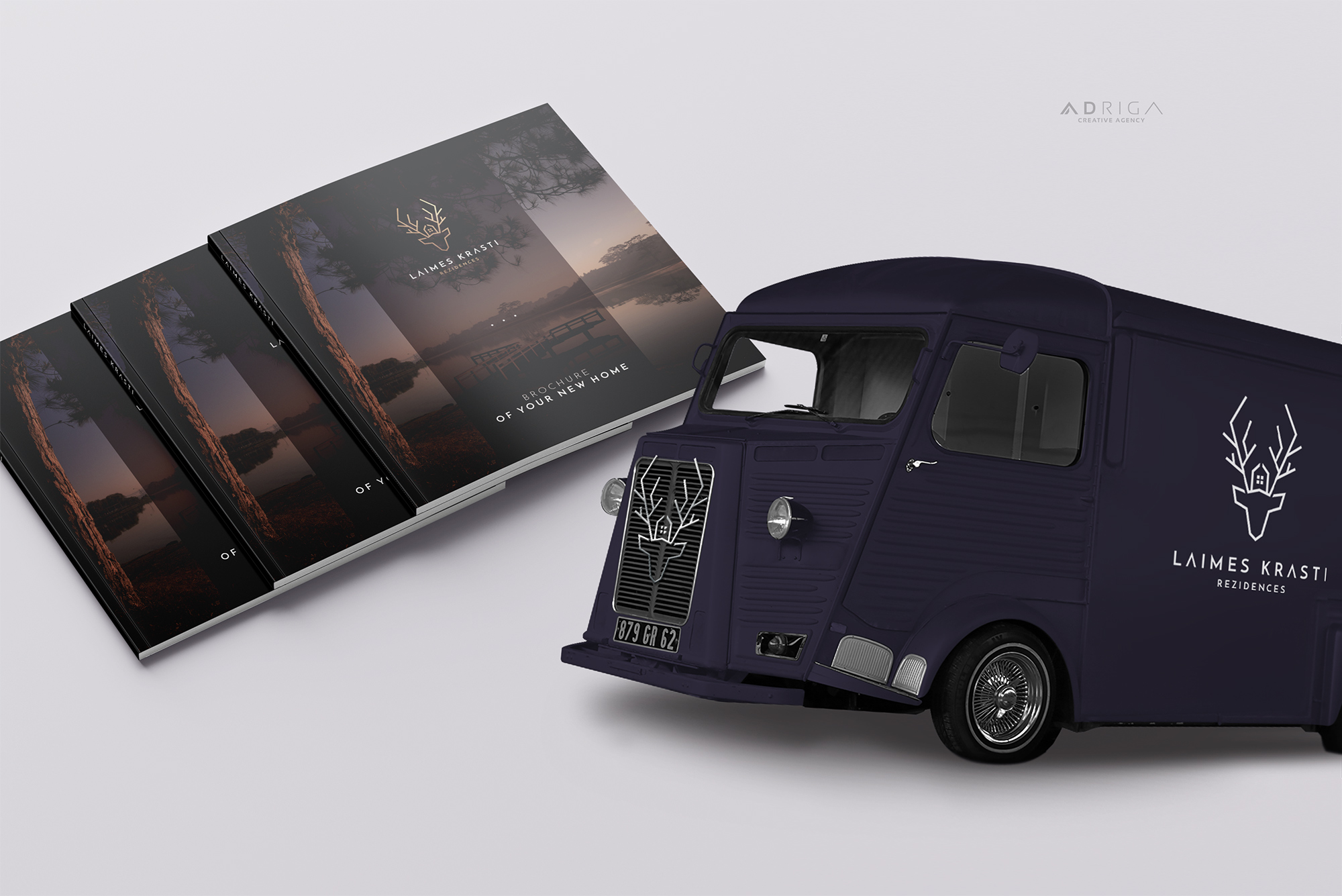
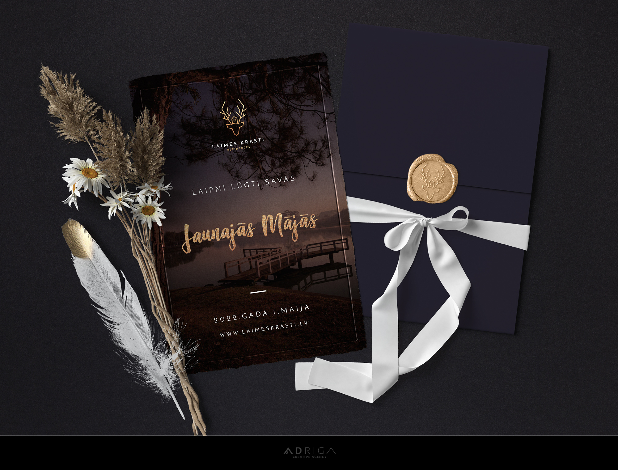
Design of brochures, car stickers and other elements:
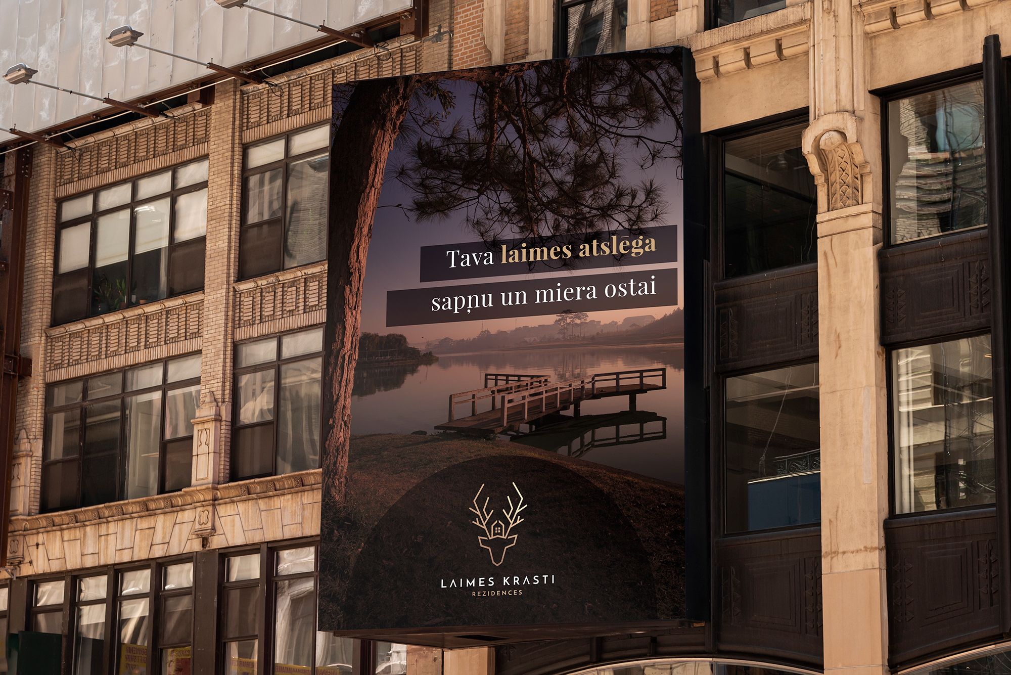
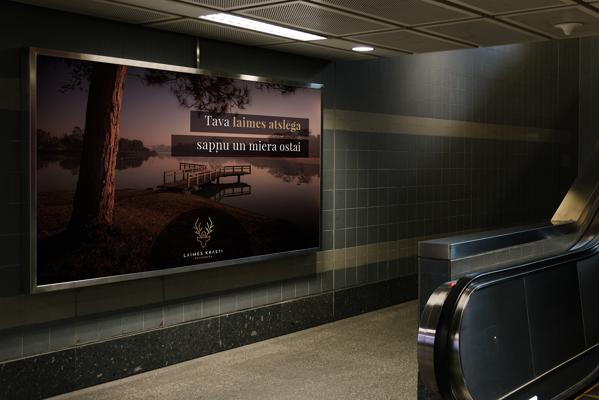
Design of banners, advertising posters and billboards; development of promotional video with professional voice-over and background music:
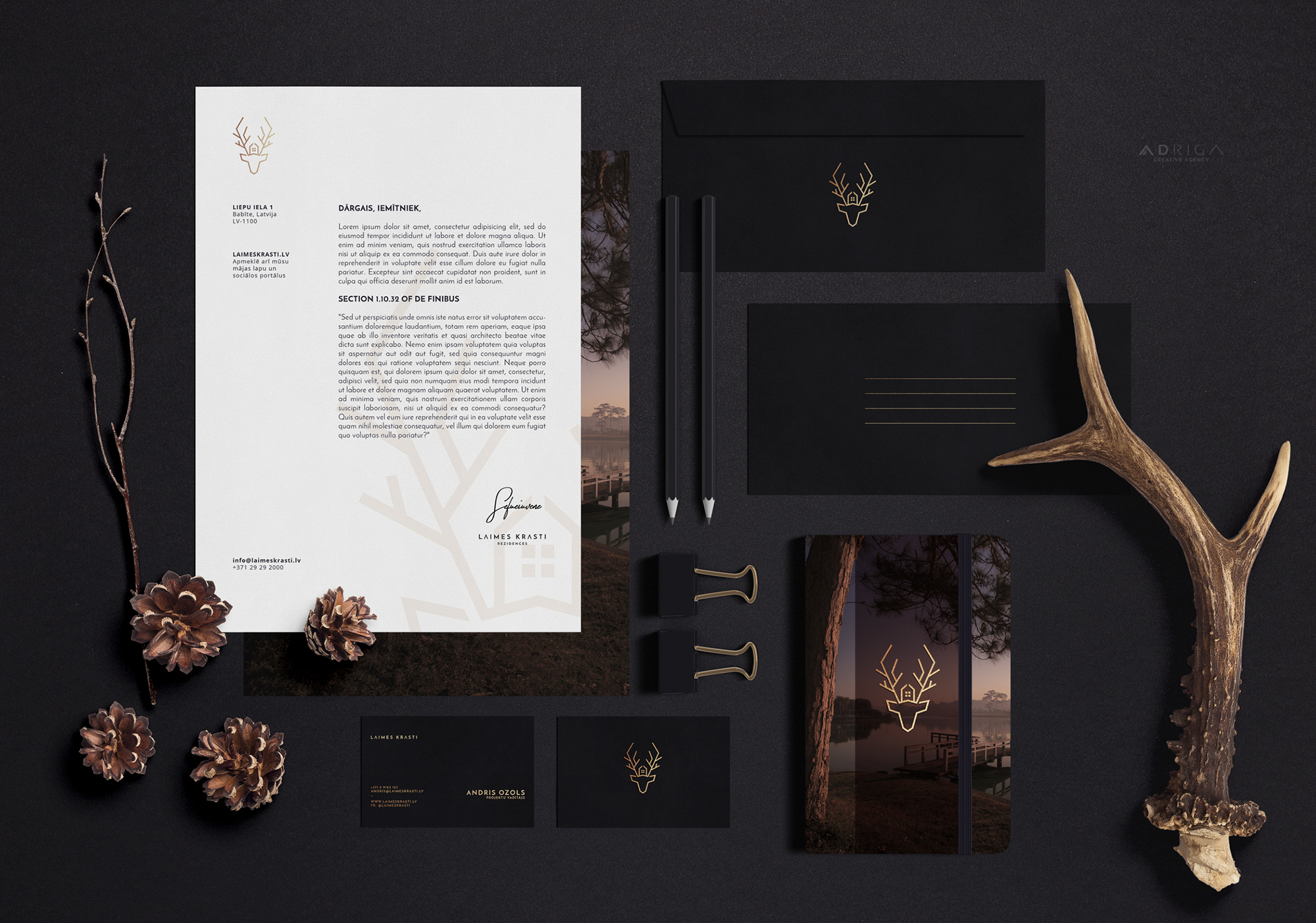
Design of business cards, letterheads, envelopes, folders, and other elements:
Conclusion
Creation of visual identity is an extensive work, which serves as an important investment in the operation of each company and assures customers of high quality, reliability and professionalism.
The development of a professional logo and visual identity is not a cheap endeavour; therefore, we invite everyone to be careful when examining tempting low-priced offers promising results within a week. Even if you are initially satisfied with the result and have used the logo for a year or more, printing it on countless business cards and other elements, you might find out one day that the logo is a plagiarism. In way too many cases a customer may also unexpectedly realize that the logo contains too many small details or does not work in a monotone version and cannot be used in certain environments for representation/advertisement.
Do you have any questions? We will be happy to answer!
Such an incredible guide on visual identity. The logo for these residences look astonishing! Thanks goes to the designers of your team for en-lighting us with your knowledge, it is helpful for many of us!
We are very glad you found it useful! 🙂
I appreciate your insightful article and thank you for sharing your process! I really enjoyed it.
There are definitely elements that I need to apply in my process as well!
What I love most about this article is that it highlights the multitude of steps that go into creating a great logo – this justifies the often misunderstood cost of branding and how creating a logo is part of a much larger process.
I already asked before the translation of this article was ready – may I use this material for my blog?
Thank you AD RIGA!
We would like that very much, thank you Jacob!
Absolutely wonderful article!!! One of the most complete and yet easy-to-understand visual identity development write-ups I’ve read to date. I love the vibe this beautifully designed deer/house/forest symbol radiates! Thank you AD RIGA for sharing with us!
Thank you so much, Audrey!
Amazing logo, amazing branding!
p.s. what font did you use?
Spot On! Very strong and educational article.
Very glad you enjoyed, thanks a lot! 🙂
I loved the line at the end “Creation of visual identity is an extensive work, which serves as an important investment…”. Can’t agree more! Logo is not a tiny, quickly created, insignificant image. It is the base of identity and symbol of the brand. Superb post…
Glad you enjoyed! 🙂
Really glad I found this, I’m planning on shifting my focus into branding and this’ll be a great help. The identity you created for Laimes Krasti is marvelous!
You’re most welcome! Thank you for the kind words 🙂
I learn from a lot of your posts… Love these step by step visuals. how do you communicate to your clients that they are all needed?…. would love to have a call with you to absorb your knowledge if you’re game!?
Hi there, Adam! Let’s have a chat! 🙂
I want to interview you regarding branding and logo design. Sent you an e-mail ?? Please check it out
Just had thoughts about it early this morning… And here I am with the opportunity!! Thanks Thanks thanks 🙂 Such a powerful identity you created there
There you go! Good luck!
I have no words to express how much I love branding. And this post is extremely helpful and inspirational. I love what you did with Laimes Krasti!
Thanks a lot! Enjoy!!
Brilliant and valuable article, thank you! The colors are very well considered.
I like the concept, some useful things to keep in mind! Keep in mind for logo designing that tools matter
This is awesome! Thank you AdRiga!
It’s very interesting to see how people work about and get their projects finalized. And the entire process that you have shown up from scratch is really interesting to go through.
Thank you, we try to make it as resourceful as possible as well as explain our process which is also very interesting for other designers.
Hey AD RIGA,
Hats off, wonderful logo. Personally, I see beauty in simplicity, and Laimes Krasti logo has that simplicity and also that “wow this is amazing” factor. I mean, its wonderful what this logo represents. Looks like it was a pretty long road to get to the final design, but the end result is AMAZING. I’ve been hooked on this in my mind for a couple of days. Love your work guys!
Seems like your system works great for you, each and every of these concepts look remarkable! I would love to have a new logo for my quilting web site. How may we proceed?
Thank you,
Connie
Thank you, Connie! It’s a well oiled machine ? Feel free to get in touch with us +371 25 77 555 0 or info@adriga.lv and we will most happy to help!
These are quite interesting tips about logo design. It is very true that outstanding creative designs attracts attention and creates a positive impression about a brand so its better it is done by experts in the field.
Thank you very much!
That is very attention-grabbing, You are an overly skilled designers.
I’ve joined your rss feed and look ahead to seeking extra
of your fantastic posts. Also, I’ve shared your site in my social networks
Great definition and description of how visual identity is created. I love it. Good work!
Real facts right here. Superb logo on “LaimesKrasti”! Thanks for sharing. Keep inspiring 😉