Building a trustworthy and visually attractive brand identity for your dental practice may be the single most important thing you can do to set yourself up for success in the long term. With more than 20 years of experience we can surely say we do know the impact of a powerful brand identity.
Today, we’re highlighting 3 amazing dental brand identities we have recently created. Review these dental branding examples, see what these brands are doing right, and consider how your own practice branding holds up to the competition. Ask yourself — is my practice a brand? Without it, you risk being just another dental practice, lost in a sea of hundreds of other dentists.
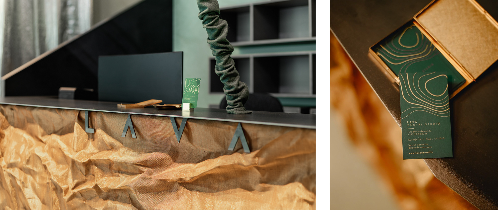
1. LAVA Dental Studio
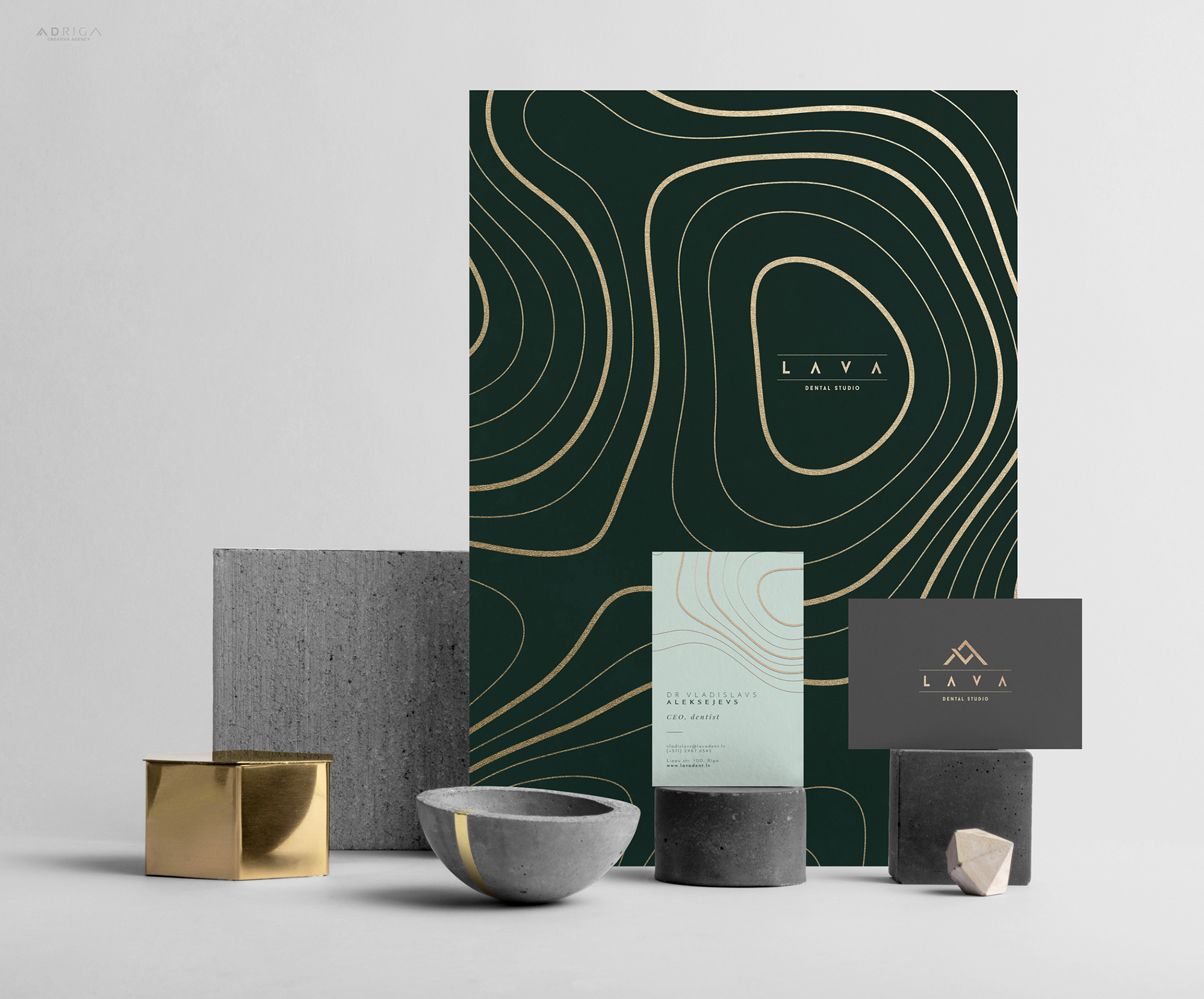
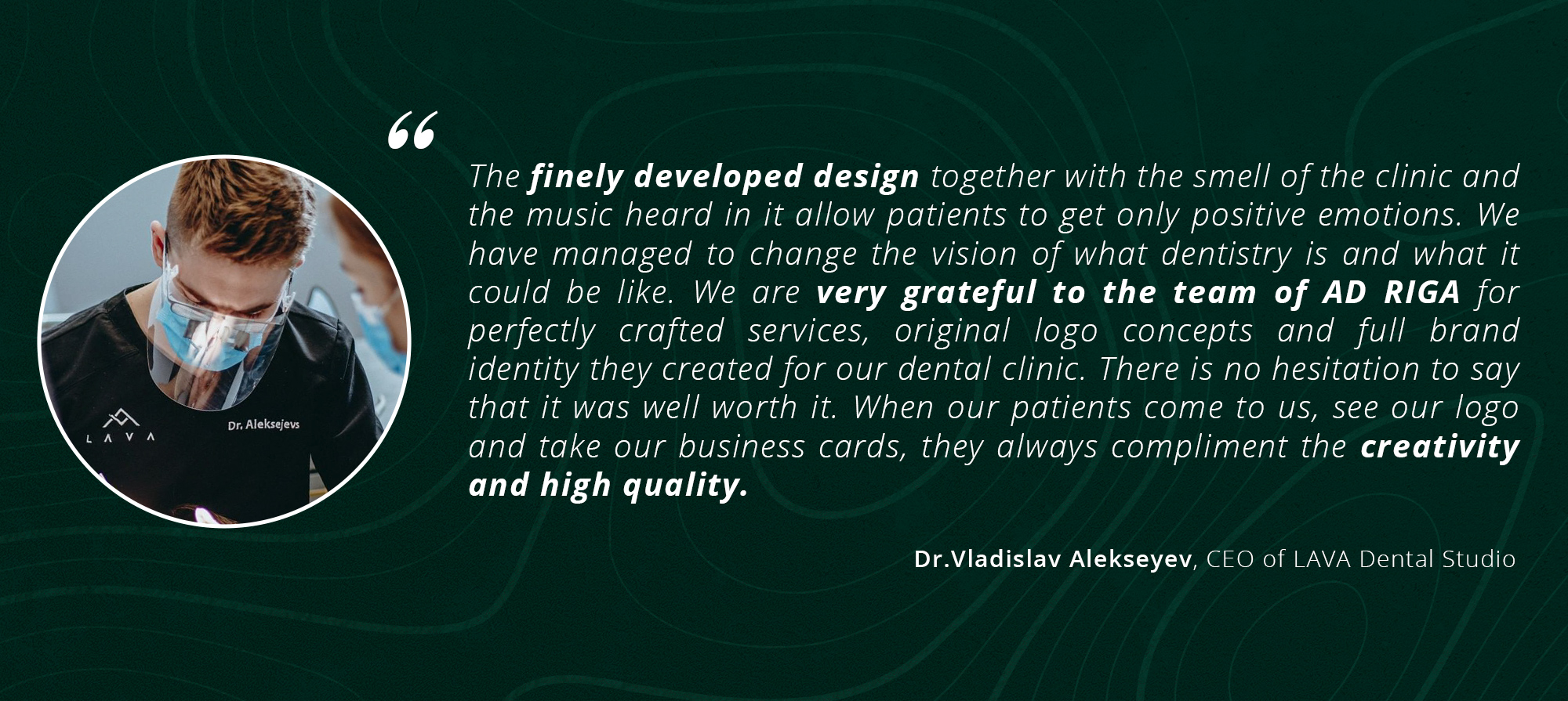
When we created brand identity for the LAVA dental studio, its founder Vladislav Alekseyev said he wanted to break the stereotypes about visiting the dentist as an unpleasant event. «Unfortunately, dentistry in the Baltic States still suffers from the seal inherited from the Soviet era. Faint wall colours, the specific smell and bad music all make a dentist appointment scary, unpleasant and give the impression that it is not stylish to visit the dentist in general. It results in many oral and dental health problems, so when planning LAVA dental studio, we wanted to create a feeling of a spa or a design hotel,» says Vladislav. That is why he invited our agency to take part in the development of the clinic.
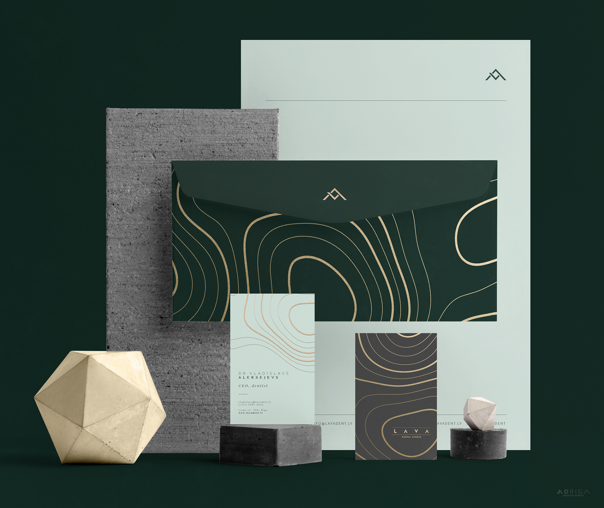
The name of the clinic “LAVA” was formed from the initials of the owners and served as a starting point for the design. In developing the design concept, we drew inspiration from the way lava flows and transforms. «This natural phenomenon is also a metaphor for the patient’s experience: after visiting the clinic, the patient feels positively transformed and has regained well-being and health,» Scott Hughes, our senior designer points out.
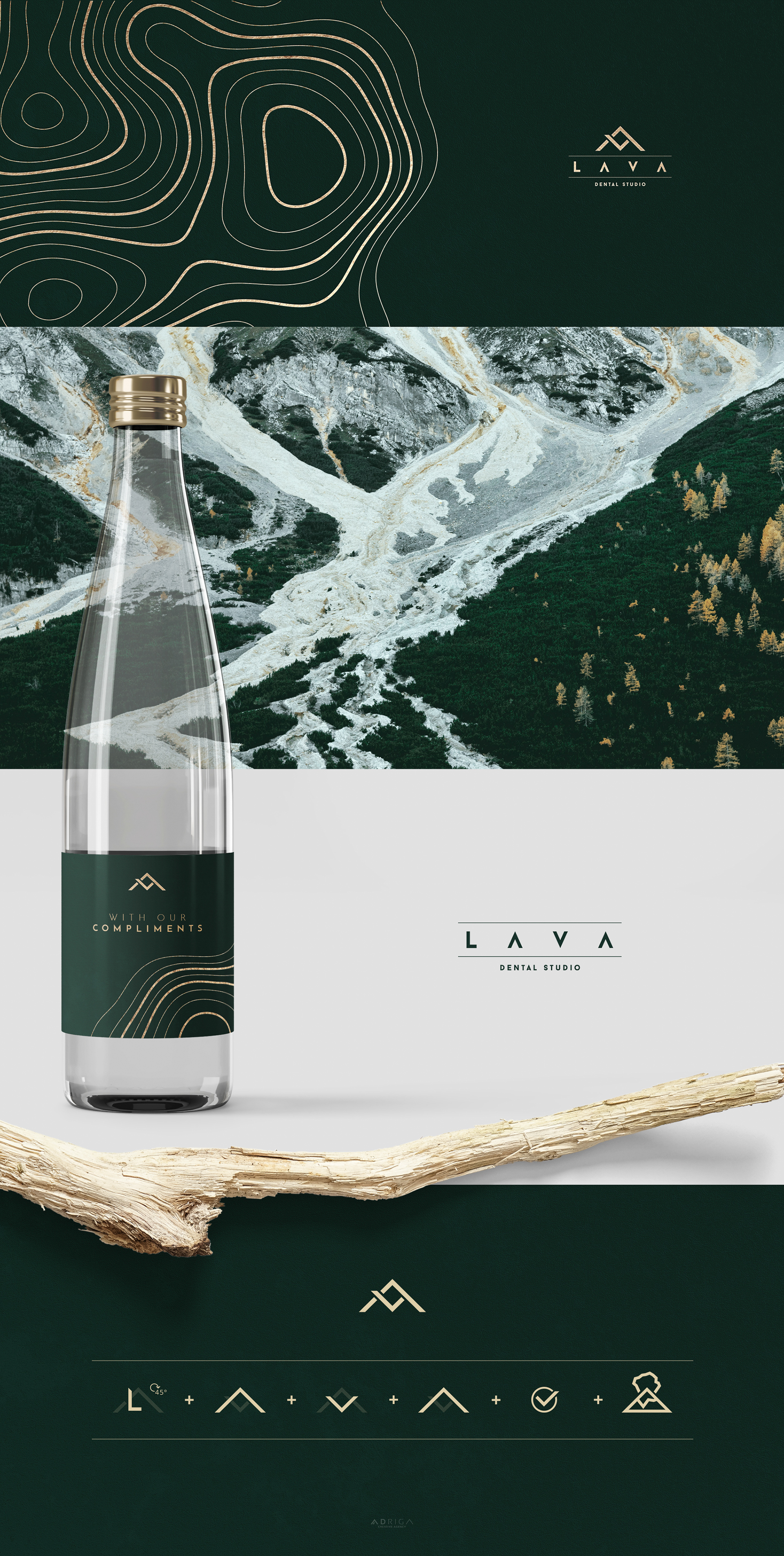
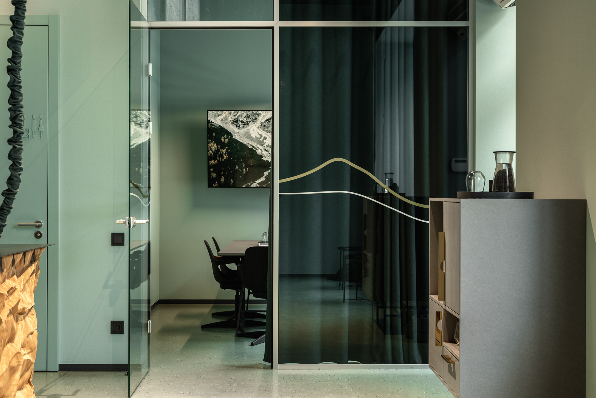
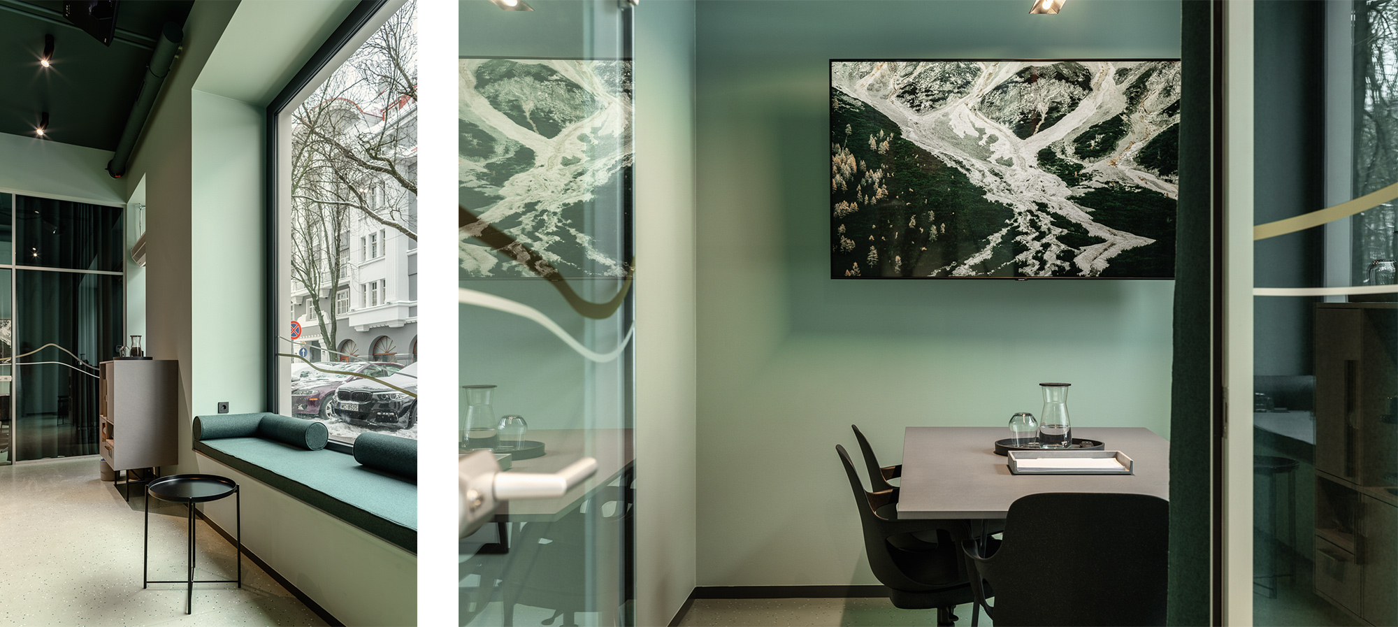
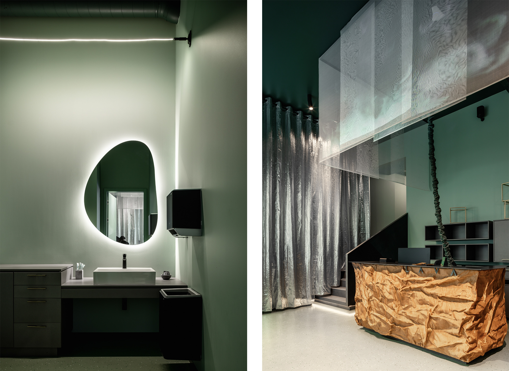
It was important for us to create a minimal and memorable symbolism that could be used equally easily for the clinic’s signboard, as well as for work clothes and the interior. The overall shape of the logo is not only initials of the owners L-A-V-A, but also a reminiscent of a volcanic silhouette with a check mark for a job well done. The geometry of the logo echoes the values of the clinic — accuracy and modern technologies. The straight lines are contrasted by a stylised lava pattern included in the graphic identity. The forest and earth tones used in the identity, complemented by gold accents, create a feeling of luxury and peace.
The graphic design elements permeate the premises of the clinic. As the client’s wish was to be different from other dental clinics, we aimed for original solutions that do not include the usual symbols with teeth and smiles.
LAVA dental studio has now been open for six months, and the head of the clinic Vladislavs Aleksejevs is satisfied with the achieved result:
LAVA dental studio is designed like a boutique. The environment of the clinic should be functional, clean and sterile, however, this did not prevent us from choosing expressive colours and materials. The design solutions of LAVA dental studio are aimed at creating a pleasant experience for the client. Expressive materials, original details and a holistic approach are changing perceptions of medical institution design.
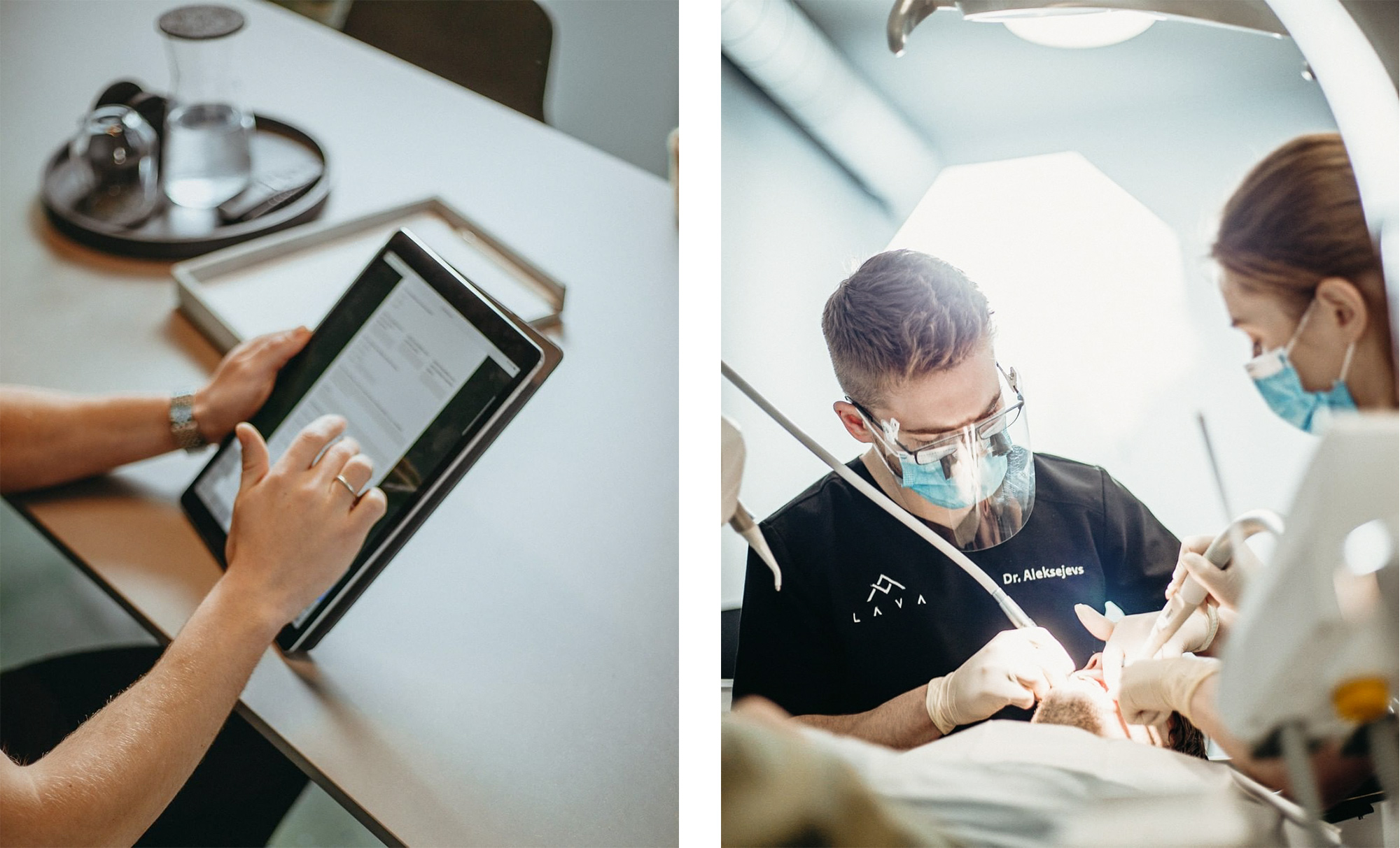
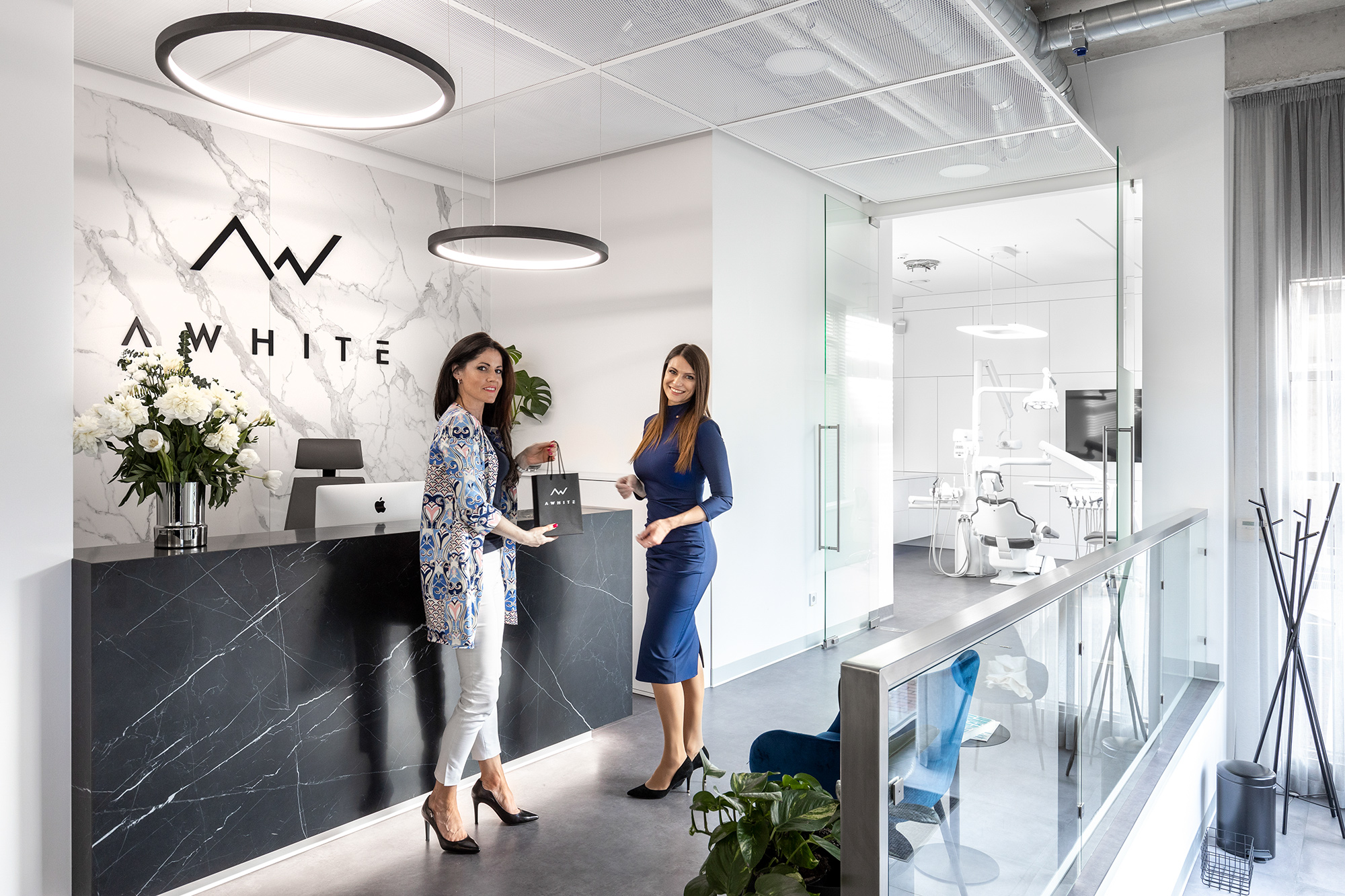
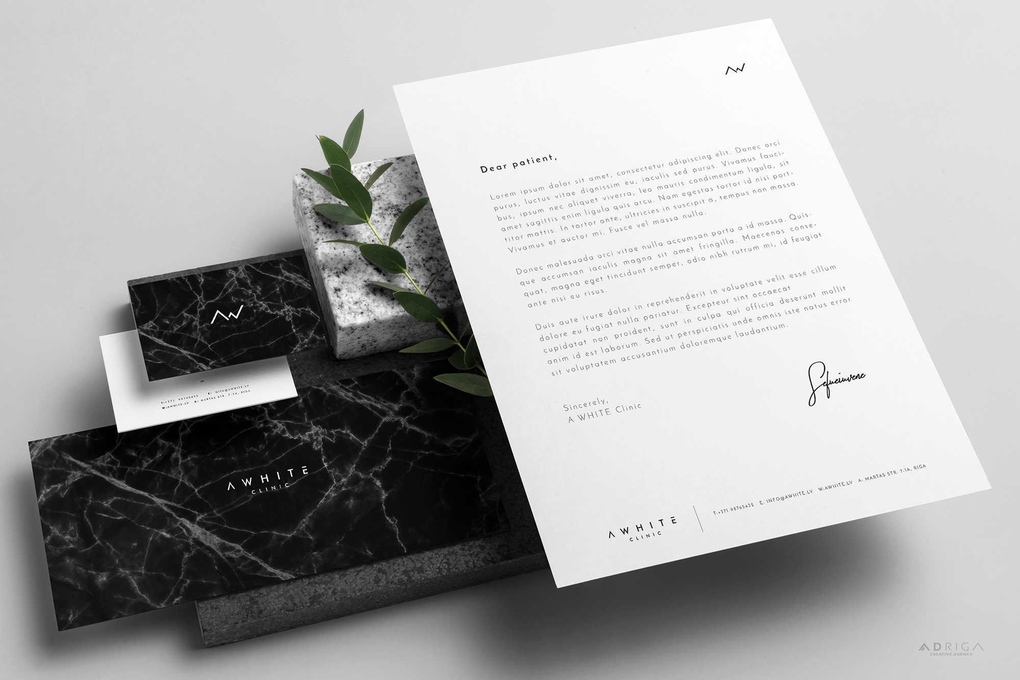
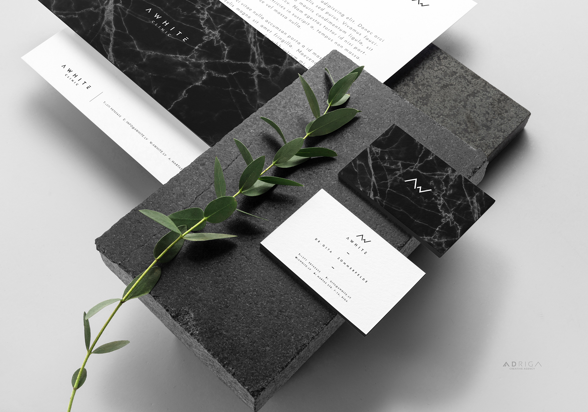
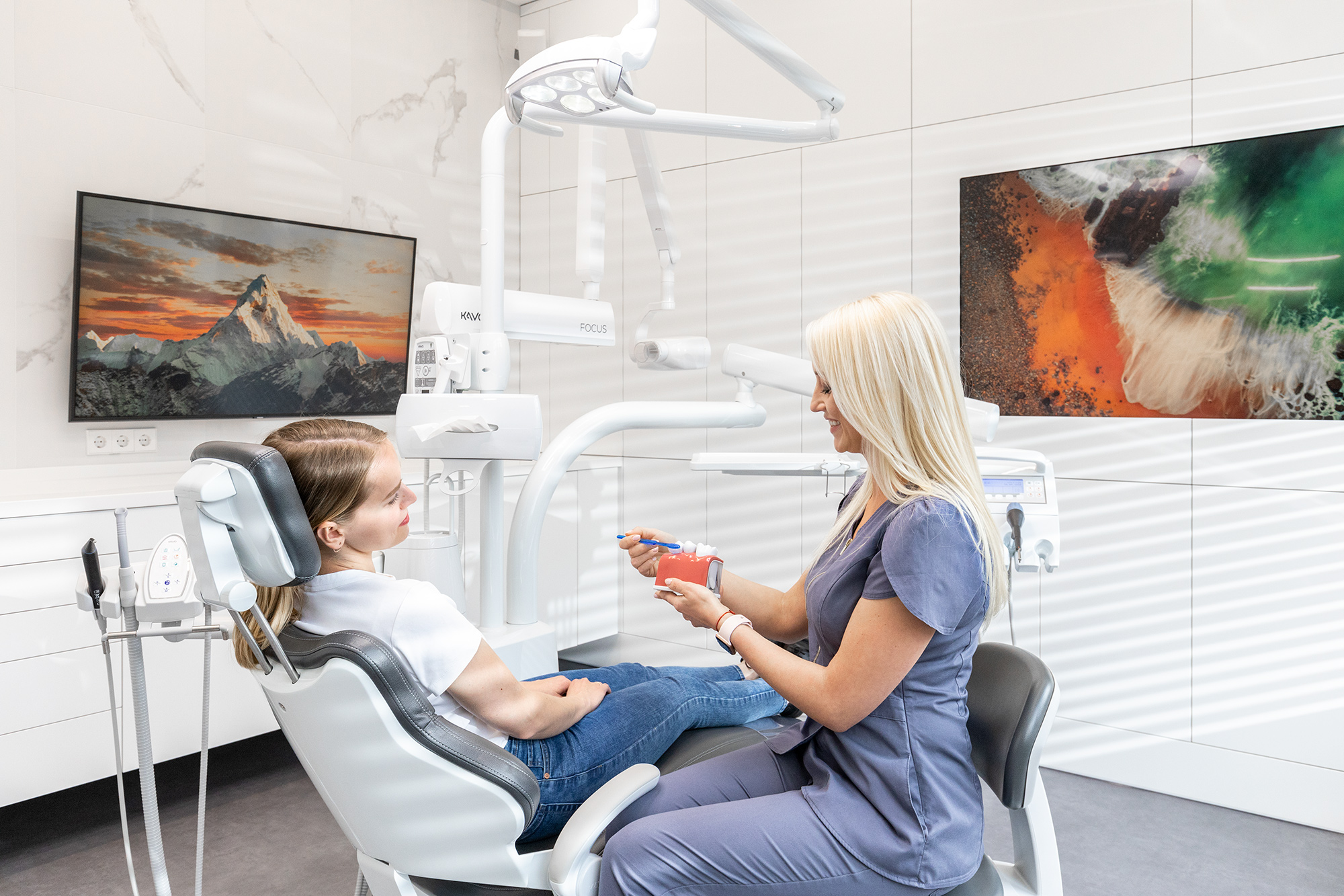
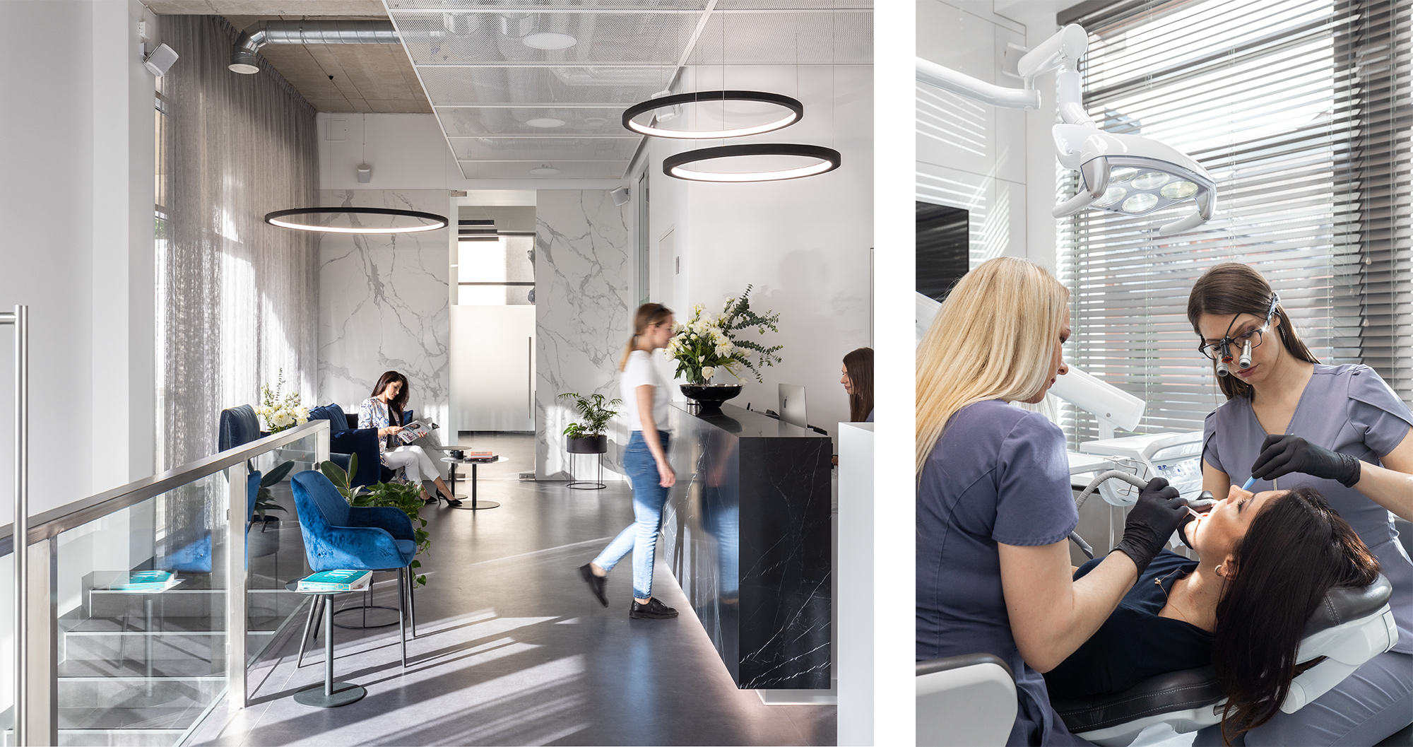
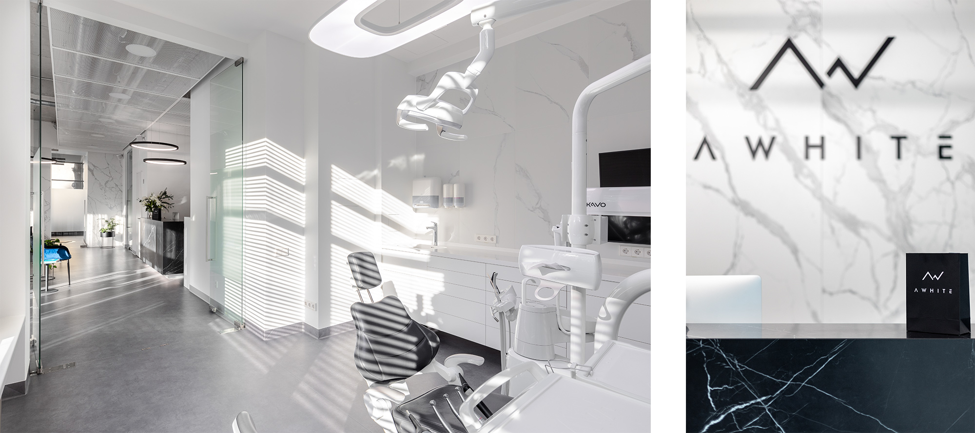
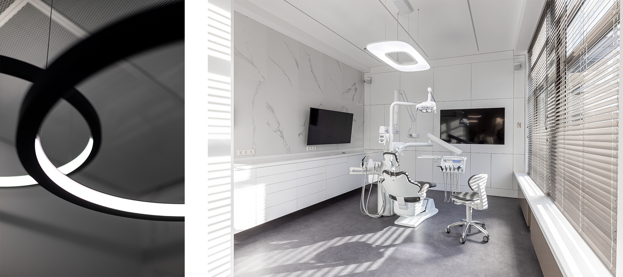
2. A WHITE Clinic
![]()
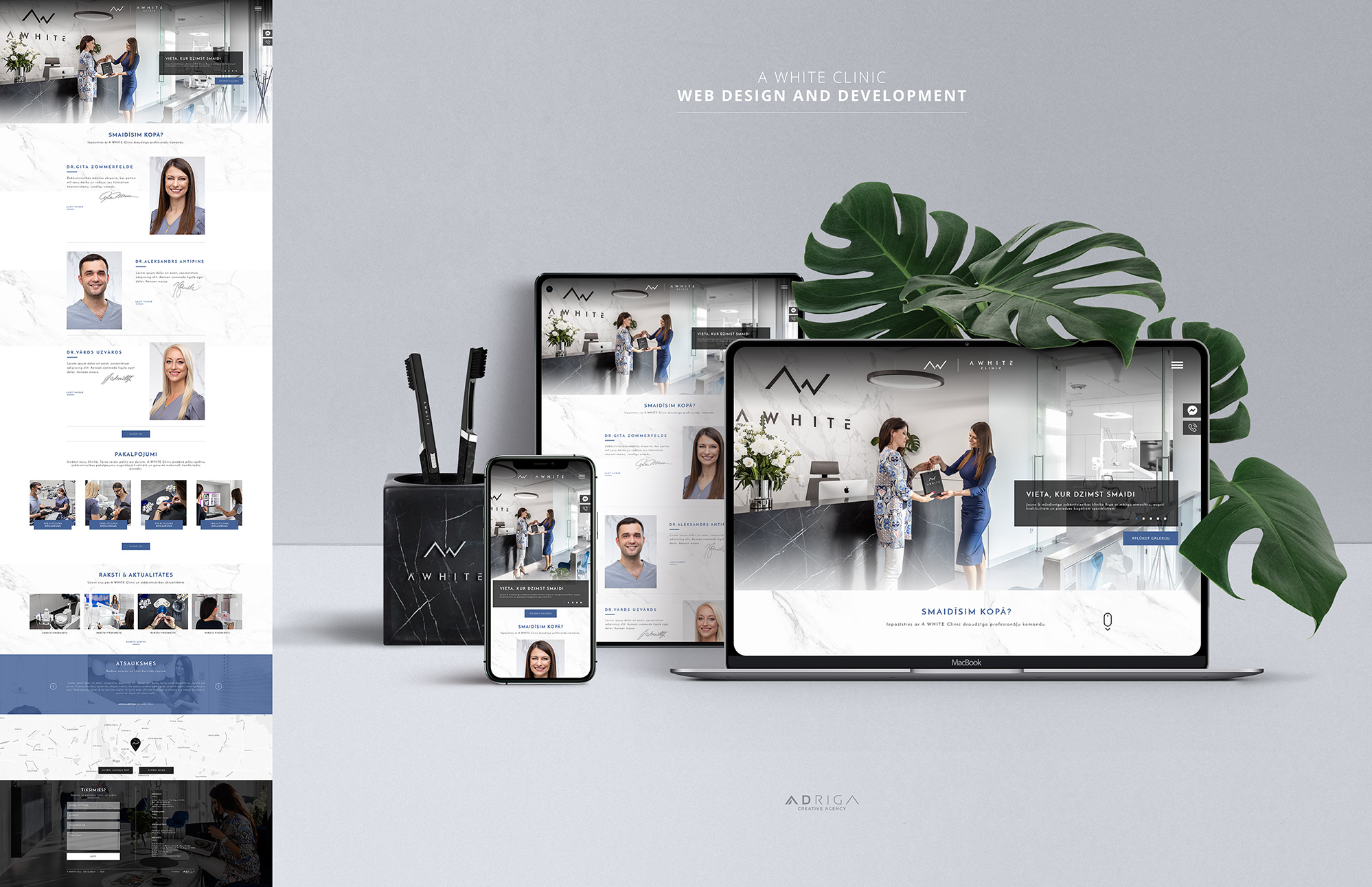
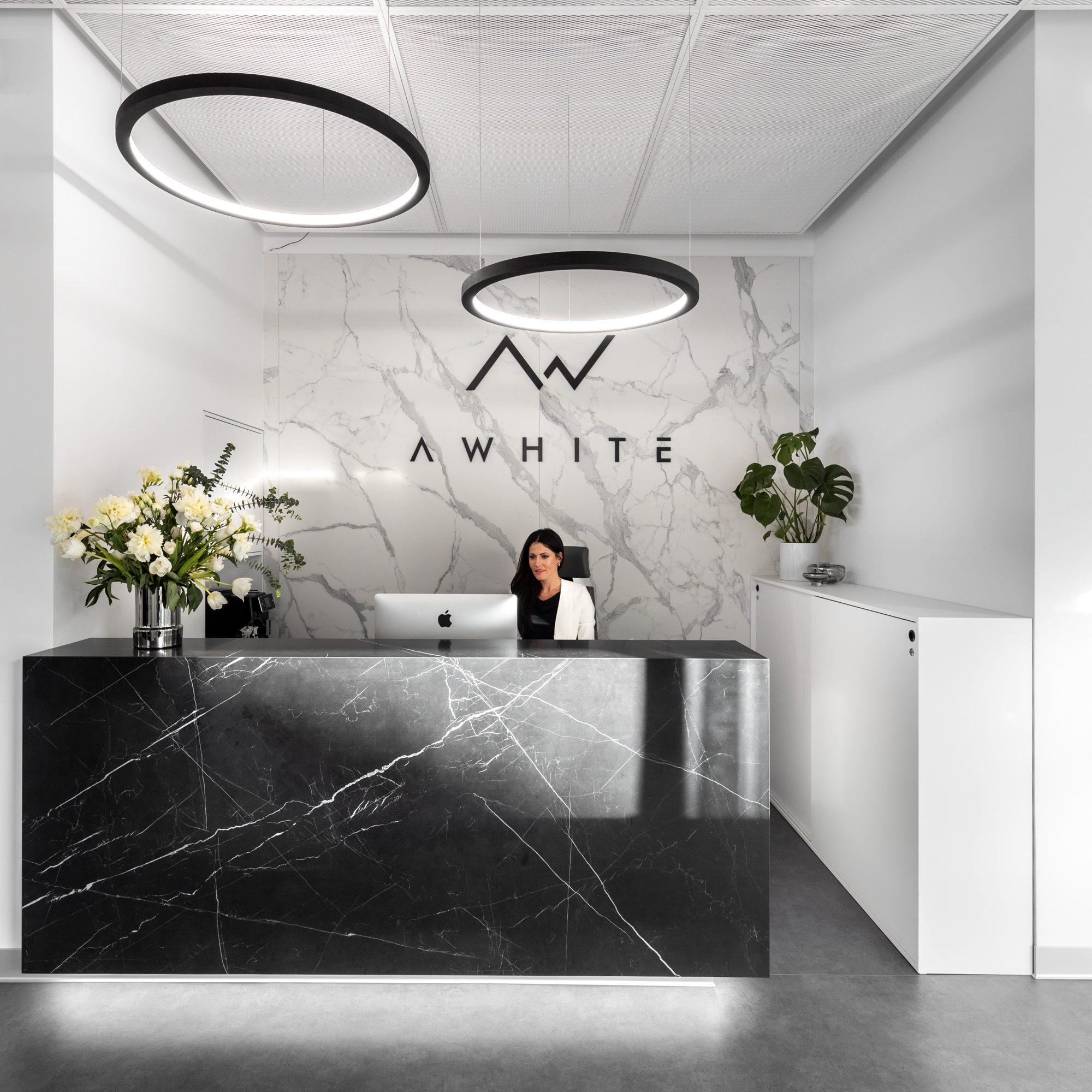
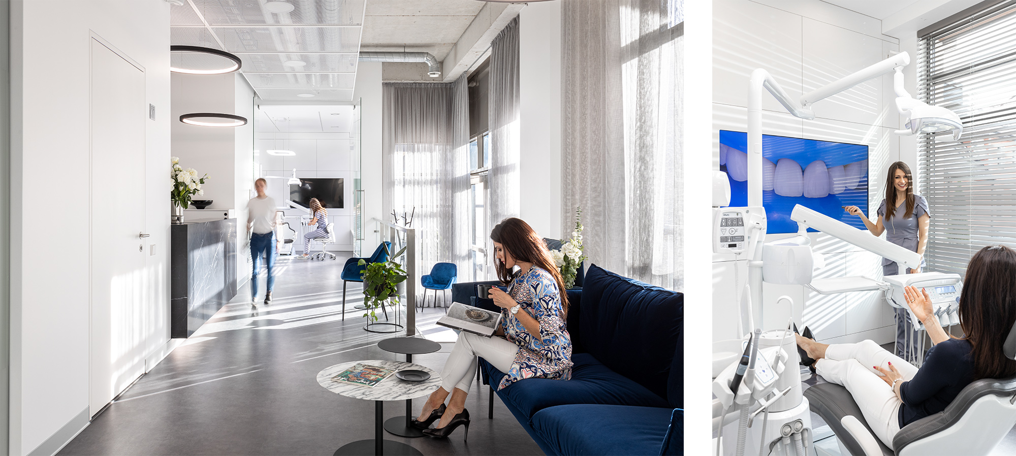
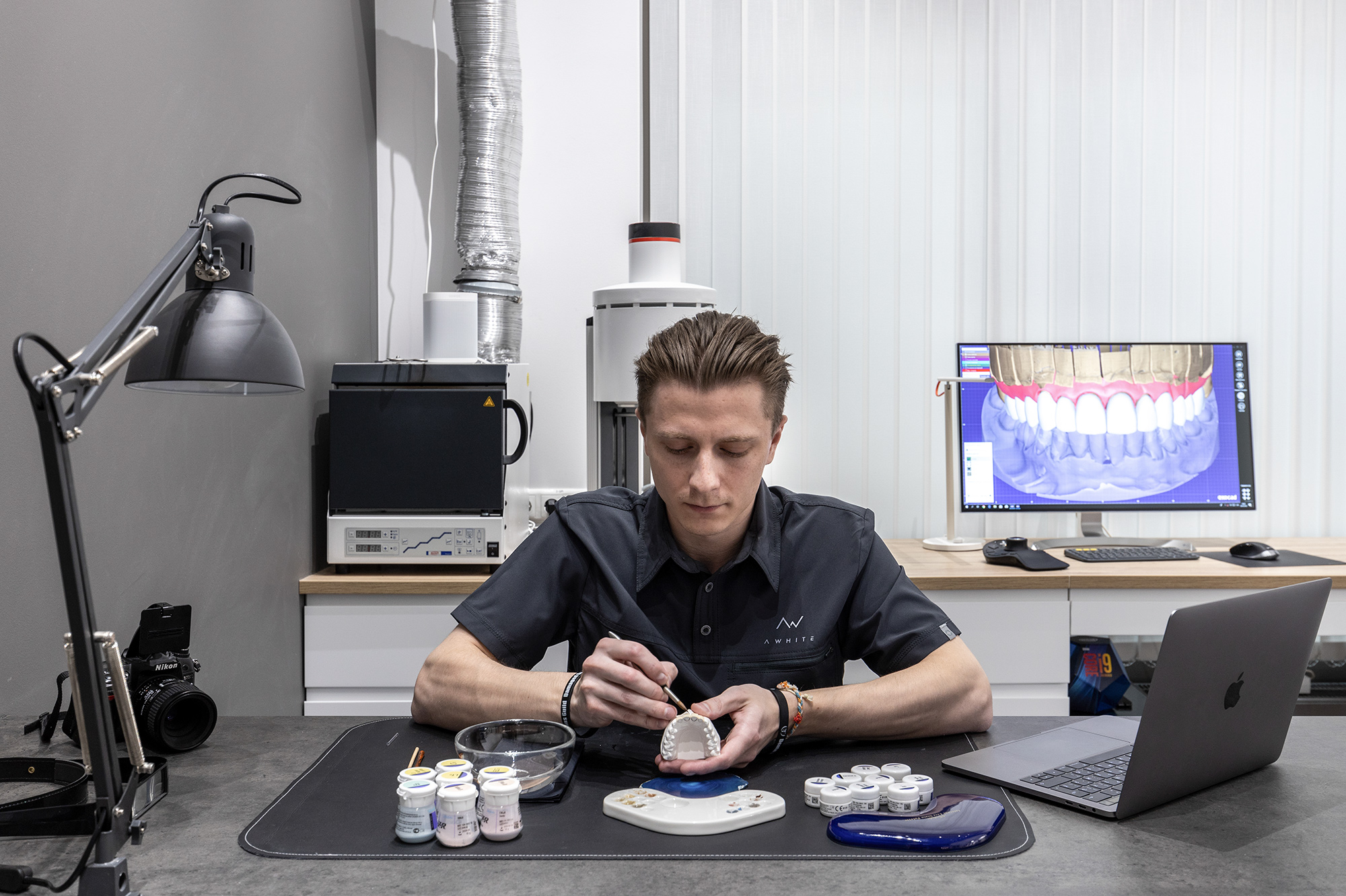
“A White” Dental Clinic is one of the most well-known new dental brands in Northern Europe. It is sophisticated and unique in many ways. This practice leans heavily on technology — and not just dental technology. Patients schedule their appointments online, fill out patient paperwork on an iPad, and enjoy Netflix during their appointment.
Letter “A” in “A White” represents the initials of the owner and it also stands for the high-class services.
![]()
We strived for modern, minimalistic design, carefully crafting every part of corporate identity elements. Our main goal was to avoid using clichéd and overused icons such as teeth, smiles and stars in the logo design.
![]()
The clean and sophisticated web design that we created works as a “window” into the clinic. We made very clear instructions for the photographers and used large photos with their bright, tech and plant-filled office as well as happy images with welcoming doctors to create a genuine feeling of the actual visit and rule out the emotion of stereotypical painful and uncertain trips to the dentist.
The end result is a beautiful and modern web design that perfectly describes who they are as a practice and how they help improve the lives of their patients.
3. Transcend
![]() “Transcend” is a brand new dental clinic in Vancouver (Canada) currently in development (May 2022). It is a specialized, exclusive dentistry that offers luxurious VIP experience for its patients. The name of the brand means to “go beyond the limits” and to “surpass expectations” and this is what the concepts represent.
“Transcend” is a brand new dental clinic in Vancouver (Canada) currently in development (May 2022). It is a specialized, exclusive dentistry that offers luxurious VIP experience for its patients. The name of the brand means to “go beyond the limits” and to “surpass expectations” and this is what the concepts represent.
![]() The mark of the following concept is a letter “T” positioned on a podium as a symbol of superiority over competitors. The graphic part of the podium is created by three lines (technology, experience, quality – as well as a representation for all the three words “Transcend – Specialized Dentistry”). The increasing size of the lines and the negative space between them coupled with the base of the letter “T” generates an optical feeling of motion / development that relates to the word “Transcend” itself.
The mark of the following concept is a letter “T” positioned on a podium as a symbol of superiority over competitors. The graphic part of the podium is created by three lines (technology, experience, quality – as well as a representation for all the three words “Transcend – Specialized Dentistry”). The increasing size of the lines and the negative space between them coupled with the base of the letter “T” generates an optical feeling of motion / development that relates to the word “Transcend” itself.
![]()
Conclusion
Branding in dentistry is now more important than ever. Not only it aims to establish a significant and differentiated presence in the health market that attracts and retains loyal patients, but it also plays a major role in standing out in a sea of hundreds of other dental clinics. A beautifully designed visual identity doesn’t just support a brand. It elevates it.
We hope you enjoyed this post as much as we enjoyed working on these brand identities. We would be thrilled to elevate your dental practice to a brand new level too!
If you are interested in hiring us, we’d love to hear from you at: info@adriga.com
Useful links:
• Our Portfolio – Take a Glance at Other Projects
• 10 Steps to Creating a Powerful Brand Identity
• 8 Golden Rules of Logo Creation
• What Our Clients Say About Us
What are your thoughts? Feel free to comment below!
Never have I thought the brand identity could actually change the way I feel about visiting a dentist, but here it is. Truly beautiful!
Hi John! Thanks so much, it’s great to hear you are feeling that way!
Sincerely,
Martin
AD RIGA – Creative Agency
As silly as it sounds I’ve always been afraid of dental office visits. This on the other hand generates completely opposite and positive emotions. Good job creatives!
Good day to you Jessica! Thanks so much for taking the time to leave a comment! We’re glad we can help to reshape the old stereotype of how “frightening” dental visits are 🙂
Connor
AD RIGA – Creative Agency
Wow!! I feel amazed how inviting, calm and gorgeous these clinics look. Superb job on graphic design. Where are they based?
Hi Rhonda! This is a lovely comment to read. Thank you! Two of these are based in Northern Europe, though we work with clients all over the world 🙂
Cheers,
Connor
AD RIGA – Creative Agency
Incredible designs, love how these dental clinics look. May I use this material for my blog?
Thank you AD RIGA!
Thank you so much for your support and endorsement! Feel free to do that, a back link would be much appreciated! 🙂
Cheers,
Scott
AD RIGA – Creative Agency
If your teeth are the most priced asset then you absolutely require a dentistry of the highest quality possible. These clinics give the impression I can fully trust them. Amazing work on the brand identities, great post!
Hi Laurent! Thanks so much for your kind words and support!
Scott
AD RIGA – Creative Agency
Such brilliant brand identities! So thoughtful and considered! Love this!
We are thrilled to read this! Thank you Monica!
Many Cheers,
Scott
AD RIGA – Creative Agency
I love everything, each of them pass different messages. Great inspiration. I adore all of them!
We adore these clinics too, the people working there are truly awesome, thanks so much for taking the time to leave a comment! 🙂
Connor
AD RIGA – Creative Agency
Very clever brand identities. It all fits perfect! ? Makes you feel at home even before you visit the clinic. Thanks for sharing!
Perfect! That was exactly what we aimed for, especially in creating the brand identity for the A WHITE clinic. Thank you for your kind comment!
Connor
AD RIGA – Creative Agency
I was referred to this post by a colleague. I would love to order a brand new logo design from you guys, I love it! What’s the process to get started?
Lovely to hear from you Brent! Sent you an email.
Sincerely,
Martin
AD RIGA – Creative Agency
Looks great!! I am huge fan of your work, love it thoroughly! A WHITE Clinic is my favorite one, love how clean and simple it looks.
Very grateful to hear this! Thanks so much Alison!
Connor
AD RIGA – Creative Agency
Hey AD RIGA creatives! Just sent you a message! I would love to work with you
Awesome! Sent you an email a minute ago 🙂
Sincerely,
Martin
AD RIGA – Creative Agency
Wow wonderful! These logos look beautiful, clean and elegant. LAVA is the one I love the most. Totally rocking it.
Hi Mitch! Thanks so much, your comment really does mean a lot to us!
Connor
AD RIGA – Creative Agency
I am totally sold on your designs 🙂 they are exact and precise. Bullseye!
Lovely to hear this Joanna, thank you! 🙂 I hope you have a wonderful day.
Scott
AD RIGA – Creative Agency
Awesome work folks! Unique ideas and beautiful outcome. keep it up and continue to create more inspiring work!
Thanks so much Jen, have a creative week a head of you!
Scott
AD RIGA – Creative Agency
Dope! Love the style of presentation 🙂 This is amazing. I’m fan already :))
Great to know there are like minded people out there, thank you for the kind words! 🙂
Scott
AD RIGA – Creative Agency
really really clean, love how crisp and high class it looks 🙂
Hi Jody! Thanks for letting others know what you think. We truly appreciate your comment!
Connor
AD RIGA – Creative Agency
Awesome designs, keep up the great work guys! The idea behind the LAVA logotype is genius!
Thanks so much for your kind words! It really means the world to us!
Scott
AD RIGA – Creative Agency